User talk:MateusinhoEX/MagazineTest
Section Names
- 1 Keyhole Report-keyhole stuffs
- 2 .net Report-.net stuffs
- 3 Trinity Archives-KH news
- 4 Featured Media- what it says
- 5 Dive to the Heart-walkthrough of the day
- 6 Olympus Coliseum-arena page
We need a better name for page 1,2, and 4. Suggestions? Freezing Cold
- Page 1: The Keyhole's Unlocking
Page 2: Kingdom Hearts's Renewal
Page 4: Hall of Rewards. I dunno something like that? Erry 20:21, 4 March 2013 (UTC)

|
| |||||||||||||||||||||||||||||||||||||||||||||||||||||||||||||||||||||||||||||||||||||||||||||||||||||||||||||||||||||||||||||||||||||||||||||||||||||||||||||||||||||||||||||||||||||||||||||||||||||||||||||||||||||||||||||||||||||||||||||||||||||||||||||||||||||||||||||||||||||||||||||||||||||||
- Of course you can help, Final Rest. I would be grateful. Today I have some homework to do, so I will not be able to help very much. But if you want, you can change the template, anything. - MateusinhoEX 14:21, 6 March 2013 (UTC)
Contents
I was taking a look at the contents page and I think it might be too cramped to put both the Secret Report and the Contents on the same page. The contents should be the main focus, so it should go up the top, but in that case I don't want the Secret Report to just be shoved to the bottom of the page. So, I was wondering if you think we should tab the contents page so it'd look something like this. Do you think that makes the page tidier or do you think it should be left as it looks now? 
 FINALREST
 09:57, 12 March 2013 (UTC)

|
| |||||||||||||||||||||||||||||||||||||||||||||||||||||||||||||||||||||||||||||||||||||||||||||||||||||||||||||||||||||||||||||||||||||||||||||||||||||||||||||||||||||||||||||||||||||||||||||||||||||||||||||||||||||||||||||||||||||||||||||||||||||||||||||||||||||||||||||||||||||||||||||||||||||||
- Looks good, but how would we pick which images to put? TheFifteenthMember 14:30, 16 March 2013 (UTC)
- Hey guys!! I am a little busy these days. Well, lets explain somethings:
- About the Secret Report. Do you wish to leave it as it is, or change it's look, with it's new colors to make it look like the other pages, or change all other pages to look like it? Or just leave it different, like a special page?
- About the missing pages. I just didn't had time to add them yet, no special reasons XD.
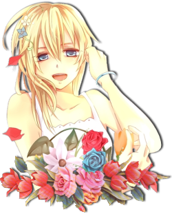
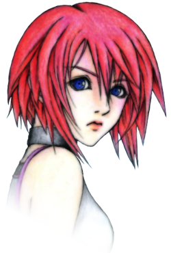
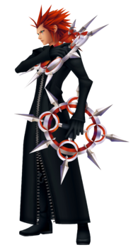
- And last, about gaps, not just in contents, but in any pages it may happen. I can't help with this, because I use a resolution in which... well... there aren't any gaps!! So, you solve it as you wish. I can only say that the images looks veeeery good. I loved them. We could use images related to the respective Trinity Archives and Dive to the Heart of the issue. For example, images of KHHD ReMIX, χ[chi], and some of the game in the walkthrough of that issue.
MateusinhoEX - 16:02, 16 March 2013 (UTC)
For the secret report, I just tried to make it look as similar to the real Secret Report in the game as I could. I would've been able to do more with html, but, well, wikia *shakes fist angrily*. I think it's fine to have the pages a little different, especially since pages like the Featured Editor page will be changed according to the author for that issue, so the variety will be a good change. As for the contents, since you guys like it, I'll add in a code later for the image. For the pictures, you hit the nail on the head, MEX. I too was thinking we just customize them according to the content of that issue, so I guess we'll just do that. :) 
 FINALREST
 13:41, 17 March 2013 (UTC)
- Fine. Then these points are solved. I will just add the missing pages. I also don't know how to do with the Roundtable page. Could you help me? MateusinhoEX - 16:17, 17 March 2013 (UTC)
Test
Well, I decided to test some sections of the Magazine to see if they are working properly.
 | ||
Page 3 - The Ansem Reports
Page 4 - Unlocking the Keyhole
Page 5 - The Door to Light
Page 6 - The Coliseum
Page 7 - The Keyblade Master
Page 8 - Dive to the Heart
Page 9 - The Round Room
Page 10 - Mark of Mastery Exam
Page 11 - Naminé's Sketchbook
Page 12 - The Grid
Page 13 - Flick Rush
| ||
 by [[User:{{{ansemreportsauthor}}}|{{{ansemreportsauthor}}}]] |
 by [[User:{{{unlockingthekeyholeauthor}}}|{{{unlockingthekeyholeauthor}}}]] | ||
 | ||
| {{{unlockingthekeyholejiminysjournal}}} | ||
 | ||
 | ||
| {{{unlockingthekeyholenewusers}}} | ||
 | ||
| {{{unlockingthekeyholeteaparties}}} | ||
 by [[User:{{{doortolightauthor}}}|{{{doortolightauthor}}}]] | ||
 | ||
| {{{doortolighttrinityarchives}}} | ||
 | ||
| {{{doortolightnewusers}}} | ||
 | ||
| {{{doortolightroundtable}}} |
 | ||||||||||||||||||||||||

| ||||||||||||||||||||||||
 | ||||||||||||||||||||||||
 Chainoffire |

|
FinalRest | ||||||||||||||||||||||
| ||||||||||||||||||||||||
 | |
by [[User:{{{keyblademasterauthor1}}}|{{{keyblademasterauthor1}}}]] {{{keyblademasterpage1}}} | |
 | |
by [[User:{{{divetotheheartwikitutorialauthor}}}|{{{divetotheheartwikitutorialauthor}}}]] | |
by [[User:{{{divetotheheartgametutorialauthor}}}|{{{divetotheheartgametutorialauthor}}}]] |
 | |||
 | |||
|
| ||
 | |
{{{markofmasteryexamreview}}} | |
{{{markofmasteryexamtopfive}}} | |
Interview conducted by [[User:{{{markofmasteryexaminterviewauthor}}}|{{{markofmasteryexaminterviewauthor}}}]] {{{markofmasteryexaminterview}}} |
 Art compiled by [[User:{{{naminessketchbookauthor}}}|{{{naminessketchbookauthor}}}]] | |
To request an image, please contact [[User:{{{naminessketchbookauthor}}}|{{{naminessketchbookauthor}}}]] |
 | |
 A mysterious curse has been wrought upon the world of Kingdom Hearts! All the wicked foes that stand in the way of our favorite protagonists have been gifted with the power of invisibility! Thankfully, our quick wiki editors who are skilled in the ways of magic - as all good editors are - have managed to capture some monsters, but they need your help identifying what type of beast they have found, so their un-invisiblity spells work correctly. Help us out! Do you know who this beast is? {{{banishthebeastimage}}} Hover here for the answer! This issue's beast was captured by [[User:{{{gridbanishthebeastartist}}}|{{{gridbanishthebeastartist}}}]]. |
 {{{gridriddle1}}} Hover here for the answer! Submitted by [[User:{{{gridriddle1author}}}|{{{gridriddle1author}}}]] {{{gridriddle2}}} Hover here for the answer! Submitted by [[User:{{{gridriddle2author}}}|{{{gridriddle2author}}}]] {{{gridriddle3}}} Hover here for the answer! Submitted by [[User:{{{gridriddle3author}}}|{{{gridriddle3author}}}]] {{{gridriddle4}}} Hover here for the answer! Submitted by [[User:{{{gridriddle4author}}}|{{{gridriddle4author}}}]] {{{gridriddle5}}} Hover here for the answer! Submitted by [[User:{{{gridriddle5author}}}|{{{gridriddle5author}}}]] |
 {{{gridcrossword}}} [{{{gridcrosswordanswer}}} Click here to see the answer!] [{{{gridcrosswordprint}}} Printing version] Submitted by [[User:{{{gridcrosswordauthor}}}|{{{gridcrosswordauthor}}}]] | |
Seems like it's coming along nicely. One thing though - is there any chance of changing the color scheme of the Contents page? Personally, it looks a bit dull and awkward. I think different fonts will look very good and perhaps a dark grey or silver will work better. Just a suggestion. TheFifteenthMember 19:41, 28 March 2013 (UTC)
- This is a cool way to see how it all comes together. ^^ I'm all for changing the Contents colors, but I don't have any ideas, so go ahead and do what you think'll look nice. :) Oh, and I also filled in some of the other spaces, to see how they look.

 FINALREST
 09:50, 2 April 2013 (UTC)
Would you mind if I moved the author bit to under the title? I think it would look nicer that way... Also, do we have anyone to work on the page title images? Cause if we don't I could have a crack at them. :)  This concludes my wonderful story!
  03:38, 7 April 2013 (UTC)
- Erry said he would like to make images, but I don't think he would be upset if you give it a try. About the titles, I will change them for you, don't worry. If you want, you can make any changes to the magazine, okay? MateusinhoEX 16:48, 8 April 2013 (UTC)
Reboot!
Heya MEX, it's been a while! Since this is getting a fresh start, I'd once again like to offer my help. Is there anything you need help with regarding the template? 
 FINALREST
 14:54, 17 April 2014 (UTC)
- Hey, FR, just in time!! Im really needing help with this, since I don't have much freetime now. Basically, I need you to help me style the remaining pages, like, color of them and things like. If you want to put some fancier styles, such as shadows in the boxes and things like that we can think about it. Also, if you can help me check the variables of each article (I mean, the blank spaces, such as {{{autorname}}} and {{{topfive}}}, for example</nowiki. And I think it's just that for now. I will make some edits now and get things going. Thanks for the help! - ~~~~
Hey MEX, I also signed up to help with the coding. Is there anything you need me to do? ![]() KeybladeSpyMaster
KeybladeSpyMaster ![]() 04:27, 18 April 2014 (UTC)
04:27, 18 April 2014 (UTC)
- Lucky there's plenty help :) Basically, I need you to do the same things as FR. I managed to make a good draft now, so yeah, there's just more adjusts to do. Thanks!! - MateusinhoEX 13:48, 18 April 2014 (UTC)

|
| |||||||||||||||||||||||||||||||||||||||||||||||||||||||||||||||||||||||||||||||||||||||||||||||||||||||||||||||||||||||||||||||||||||||||||||||||||||||||||||||||||||||||||||||||||||||||||||||||||||||||||||||||||||||||||||||||||||||||||||||||||||||||||||||||||||||||||||||||||||||||||||||||||||||||||||||||||||||||||||||||||||||
Is it okay if I add my flick rush page to the template above? ![]() Chainoffire
Chainoffire![]() 02:21, 3 May 2014 (UTC)
02:21, 3 May 2014 (UTC)
The Door to Light

|
| |||||||||||||||||||||||||||||||||||||||||||||||||||||||||||||||||||||||||||||||||||||||||||||||||||||||||||||||||||||||||||||||||||||||||||||||||||||||||||||||||||||||||||||||||||||||||||||||||||||||||||||||||||||||||||||||||||||||||||||||||||||||||||||||||||||||||||||||||||||||||||||||||||||||||||||||||||||||||||||||||||||||

|
| |||||||||||||||||||||||||||||||||||||||||||||||||||||||||||||||||||||||||||||||||||||||||||||||||||||||||||||||||||||||||||||||||||||||||||||||||||||||||||||||||||||||||||||||||||||||||||||||||||||||||||||||||||||||||||||||||||||||||||||||||||||||||||||||||||||||||||||||||||||||||||||||||||||||
Flick Rush
Okay, so since we're not gonna have a mailbag until after the first issue, what do we want to have for the first mailbag? Also, I have some issues with the template, and maybe someone here can help me with them:
- I want to put images on the sides of the titles (Keyhole Tasks, KHWiki Tasks, Mailbag, and Game Task) but I can't because of the coding used here.
- How do I put words after To prove success in the task... ? are we just going to finish the sentence on the master template?
 Chainoffire
 02:15, 5 May 2014 (UTC)
- I can't answer all of it, but as far as the "To prove success in the task..." part, I had intended to have it finished on the master template. There's a comment on the template coding right there that requests the information, which I put, because I don't know where the items (questions, proof, etc.) are supposed to be sent. As for the images, I don't know if you want images on each side, since the titles are supposed to eventually be images themselves. If you still want them, I'll see if I can get it coded in, maybe as optional parameters or something. I'll see how to get it to work. As I mentioned to FM above, it'll have to wait until the end of the week at this point, because of my AP test.
 KeybladeSpyMaster
  23:18, 5 May 2014 (UTC)
- I didn't know that the titles would turn into images, so we can just leave them then. I think that it would depend on the challenge. For example, assuming that the challenge is the one in the test template (Complete Holo-Mission 93: Believe Wearing the Extreme Ring and without the Auto-Life Panel). I would probably want screenshots of the ending screen, a screenshot of their panels, and a screenshot right as you start. Also, where would the screenshots go? Would they be sent to the KHWiki email, or could they be sent to my email, since I wrote the article? (either one is fine with me). Thirdly, should we have a section where we put the names of the users who completed the project? Finally, what would happen to those users that did complete the project? Would they just get special mention in the article or would we select one to get a prize? Good luck on your AP Calc test by the way!
 Chainoffire
 04:48, 6 May 2014 (UTC)
- I think the screenshots should be sent to the KHWiki email and then the information would be conveyed to the writer. That way, potential writers won't be put off by having their email displayed publicly. And, as I said earlier, we could give those who finish tasks a special mention on the next issue, an accolade (which I'll work on), and first priority in making image requests and mailbag questions. TheFifteenthMember 18:24, 6 May 2014 (UTC)
- I didn't know that the titles would turn into images, so we can just leave them then. I think that it would depend on the challenge. For example, assuming that the challenge is the one in the test template (Complete Holo-Mission 93: Believe Wearing the Extreme Ring and without the Auto-Life Panel). I would probably want screenshots of the ending screen, a screenshot of their panels, and a screenshot right as you start. Also, where would the screenshots go? Would they be sent to the KHWiki email, or could they be sent to my email, since I wrote the article? (either one is fine with me). Thirdly, should we have a section where we put the names of the users who completed the project? Finally, what would happen to those users that did complete the project? Would they just get special mention in the article or would we select one to get a prize? Good luck on your AP Calc test by the way!
- I'm back! And, apparently, still alive... Anyways, could I have the KHWiki email to put in the template (or could someone else put it in)? As far as the image titles go, I have a potential idea of using the Menu font for it (see Pause Menu, Flick Rush logo, Commands Menu, the sidebar headers on this wiki, you get the idea, no?). Does anyone know where to get it? If not, I'll try to use Photoshop to cut the letters out, but I'd rather not.
 KeybladeSpyMaster
  23:41, 7 May 2014 (UTC)
- I'm back! And, apparently, still alive... Anyways, could I have the KHWiki email to put in the template (or could someone else put it in)? As far as the image titles go, I have a potential idea of using the Menu font for it (see Pause Menu, Flick Rush logo, Commands Menu, the sidebar headers on this wiki, you get the idea, no?). Does anyone know where to get it? If not, I'll try to use Photoshop to cut the letters out, but I'd rather not.
I was going to add the "GuesstheBeast" image until I encountered this. The size can be changed easily enough, but the problem is the invisibility the black has against the background. Is it possible to add a glow around the silhouette as a border? TheFifteenthMember 18:09, 8 May 2014 (UTC)
- Thanks for the image for the titles. I hope it will help. What I ended up doing is I'm making a font file online for free with the help of Photoshop, so that's how that's going to go. As far as the Guess the Beast image goes, is the new one okay? I added a glow somewhat as I did for the TRON disk from my talk bubbles, though granted, it seems a little more intense on the Large Body than on the Keyblade logo.
 KeybladeSpyMaster
  03:15, 9 May 2014 (UTC)
Erry made a banner for the Mirage Arena and Underdrome, which we can use to promote them and get people involved in them. The idea is we'll have the banner at the bottom of the "Coliseum" page, have text above that says "For more, visit..." and set up links. That means we can get rid of the Mirage Arena and Underdrome sections so we can focus on the Station of Awakening part. Speaking of which, the SoA will need to be divided into two with each side having a title, image and space for text so it'll be like the current Mirage Arena format. TheFifteenthMember 17:09, 9 May 2014 (UTC)
 Thanks for getting started on this MEX! Just adding onto Caf's list and what sections need to be on each page:

 Hello again. :) So, I spaced out the contents and I think it's a lot less cramped now, but it also leaves a big gap to the right of the box. I was thinking of ways to fill it, and I was thinking maybe we could put a sort of collage thing there to fill in the gap.


 - Greetings, users. System is up, and ready for user input. - 10:06 AM Sun, May 4, 2014 MST