Forum:BBS Theme: Difference between revisions

From the Kingdom Hearts Wiki, the Kingdom Hearts encyclopedia
Jump to navigationJump to search
No edit summary
m (TSH, replaced: Promotional Art 1 KHBBS → Promotional Art 01 KHBBS (2))
 
(73 intermediate revisions by 27 users not shown)
Line 1: Line 1:
{{Forumheader|The World that Never was}}
{{Forumheader|The Realm of Sleep|The World that Never was}}


<!-- Please put your content under this line.  Be sure to sign your edits with either your talk page template or four tildes ~~~~ -->
Line 112: Line 112:


and since the [http://i710.photobucket.com/albums/ww103/Xiggie2/checkedpattern.jpg BBS pattern] was officially released a few days ago, I redid the main page preview: [http://i710.photobucket.com/albums/ww103/Xiggie2/Newlogo2.png New Logo 1] - [http://i710.photobucket.com/albums/ww103/Xiggie2/Newlogo1.png New Logo 2]}}
{{MC|time=Time to draw!|happy:i like this idea! i vote aye!}}
{{Malevolence Crystalised|time=Time to draw!|happy:i like this idea! i vote aye!}}


{{Khgurl|text= I prefer the blue background over the gray one, it's more vibrant. And for the logo, I like the 2nd one. I'm not very familiar but I would like to state my opinion.}}
{{EO|time=14:37, December 31, 2009 (UTC)~|talktext=I actually prefer your first draft of the logo, Xiggie. And if I had to choose from these two, I'd pick the first one. The second one fits a tad better, but it just looks akward, what with portions of Terra's head cut off :(}}
==Welcome Template==
{{BebopKate|time=18:43, December 31, 2009 (UTC)|text=@Xion4ever & ENX: I think the welcome template is fine to change.  That's a little different than the others.}}
{{MasterAqua|time=19:07, December 31, 2009 (UTC)|text=I think the grey will do fine! If you guys do this when the japaneese version comes out, if you havn't already , I would bring in some translators to translate all the japaneese. I would love to help out in anything I can!I can draw, make banners, etc. I would love to help out if anything is needed!}}
Line 125: Line 127:
|colspan="2" align="center"|<div style="padding:3px; background-color: dodgerblue; -moz-border-radius: 7px; color:white;"><big>'''As for the beginning of the story, where will it end.'''</big></div>
|colspan="2" align="center"|<div style="padding:3px; background-color: dodgerblue; -moz-border-radius: 7px; color:white;"><big>'''As for the beginning of the story, where will it end.'''</big></div>
|-
|-
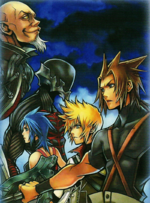
|[[File:BirthBySleep-Artwork.jpg|150px]]
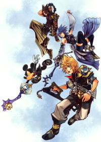
|[[File:Promotional Art 01 KHBBS.png|150px]]
|Welcome! We hope you'll enjoy browsing the Kingdom Hearts Wiki. Should you wish to contribute, here are great starting points:
|Welcome! We hope you'll enjoy browsing the Kingdom Hearts Wiki. Should you wish to contribute, here are great starting points:
:*'''[[Help:Editing]]''' will give you a tutorial on wiki markup, from basic editing to more advanced tagging.  Wiki markup is simple to learn and easy to remember.
:*'''[[Forum:The World that Never was|The World that Never was]]''' is the place to discuss issues on the wiki.  Show up there to add your input.
:*'''[[Special:MyPage|Your userpage]]''' is a great place to tell about yourself, if you want to make one. If you are struggling for ideas on what to put on your userpage, feel free to visit the '''[[Help:Beginner's Userpage|Userpage Guide]]'''.
:*'''[[Special:MyPage|Your userpage]]''' is a great place to tell about yourself, if you want to make one. If you are struggling for ideas on what to put on your userpage, feel free to visit the '''[[Help:User page|Userpage Guide]]'''.
:If you have any questions, feel free to ask any of our '''[[Project:Staff|administrators]]''' on their respective talk pages, and make sure you sign your name on talk pages with 4 tildes <nowiki>"~~~~"</nowiki>.  Again, welcome!


Line 135: Line 137:
|}
|}
{{Xiggie|time=18:34, January 1, 2010 (UTC)|talk='tis just an idea...}}
{{Xion4ever|time=19:02, January 1, 2010 (UTC)|text=Cool, nice job. As I said before, they are rough edits and should be treated as such. So, what about the Welcome ip template?}}
{{EO|time=19:56, January 1, 2010 (UTC)|talktext=I like it, Xiggie, but (and I can't believe I'm saying this) It's too much blue. Blue-on-black doesn't float with me... Might I also suggest using the Boxart instead?}}
{{DTN|time=02:28, January 2, 2010 (UTC)|text=I personally prefer this to the boxart, it provides an image with more characters. Looks good, but we may want to change it to a white background. As for the Welcomeip template, since that is such a "watered down" version of the welcome template, it should be left alone, as will be the rest of the administrative and maintenance templates.}}
{{Xion4ever|time=18:12, January 3, 2010 (UTC)|text=I like the artwork better, plus is simlar to past welcome template images. Alright, so the Welcomip template is out. Heres an example of using a white background for the welcome template-just to get ideas running.}}
{|style="background: white; color:black; border: 3px solid mediumblue; -moz-border-radius: 10px; font-size:95%; width: 95%" align="center"
|colspan="2" align="center"|<div style="padding:3px; background-color: dodgerblue; -moz-border-radius: 7px; color:white;"><big>'''As for the beginning of the story, where will it end.'''</big></div>
|-
|[[File:Promotional Art 01 KHBBS.png|150px]]
|Welcome! We hope you'll enjoy browsing the Kingdom Hearts Wiki. Should you wish to contribute, here are great starting points:
:*'''[[Help:Editing]]''' will give you a tutorial on wiki markup, from basic editing to more advanced tagging.  Wiki markup is simple to learn and easy to remember.
:*'''[[Forum:The World that Never was|The World that Never was]]''' is the place to discuss issues on the wiki.  Show up there to add your input.
:*'''[[Special:MyPage|Your userpage]]''' is a great place to tell about yourself, if you want to make one. If you are struggling for ideas on what to put on your userpage, feel free to visit the '''[[Help:User page|Userpage Guide]]'''.
:If you have any questions, feel free to ask any of our '''[[Project:Staff|administrators]]''' on their respective talk pages, and make sure you sign your name on talk pages with 4 tildes <nowiki>"~~~~"</nowiki>.  Again, welcome!
:&mdash; {{{1}}}
|}
{{Maggosh|text=I personally like the boxart better.}}
{{LA|Vtext=To put my opinion foreward, I think the second logo looks a bit better. And also, about when we release the new theme, I think the Japanese release would work better, because the Japanese release is when we will have most of our Birth by Sleep information, and that's what matters: the info, not the release of the game. The new theme should just signify the fact that we now have new Birth by Sleep info.}}
{{EO|time=10:36, January 4, 2010 (UTC)|text=LegoAlchemist brings up a good point. However, the earlier we remodel, the less time we get to do the remodeling. We have to reach a decision by Saturday, when the game is released. I'ld like the remodel finished by then, if we do, in fact, decide to remodel for the Japanese release. While I'm thinking about it, the release ''Birth by Sleep'' would bring about many vandals/new pages/spoilers and so on. We may wish to consider another staff election, in order to keep the Wiki safe, due to some of the less active staff, or those who cannot contribute as often as they used to.}}
{{Maggosh|text=If you don't mind me saying, ENX, the game actually releases on ''Friday'', since Japan is "in the future".}}
{{Xiggie|time=12:34, January 4, 2010 (UTC)|talk=I don't think a staff nomination necessary right away. We have the active admins: Azul, BebopKate, GS, Bluerfn and KrytenKoro, and we have the mods: TNE, HoO, DTN and Urutapu. I think that's way enough for now! but if a lot more vandals start to show up following the BBS release, then it should be considered.
Anyway, I prefer the boxart better, just take a look:}}
{|style="background: white; color:black; border: 3px solid mediumblue; -moz-border-radius: 10px; font-size:95%; width: 95%" align="center"
|colspan="2" align="center"|<div style="padding:3px; background-color: dodgerblue; -moz-border-radius: 7px; color:white;"><big>'''As for the beginning of the story, where will it end.'''</big></div>
|-
|[[File:Soar (Art).png|200px]]
|Welcome! We hope you'll enjoy browsing the Kingdom Hearts Wiki. Should you wish to contribute, here are great starting points:
:*'''[[Help:Editing]]''' will give you a tutorial on wiki markup, from basic editing to more advanced tagging.  Wiki markup is simple to learn and easy to remember.
:*'''[[Forum:The World that Never was|The World that Never was]]''' is the place to discuss issues on the wiki.  Show up there to add your input.
:*'''[[Special:MyPage|Your userpage]]''' is a great place to tell about yourself, if you want to make one. If you are struggling for ideas on what to put on your userpage, feel free to visit the '''[[Help:User page|Userpage Guide]]'''.
:If you have any questions, feel free to ask any of our '''[[Project:Staff|administrators]]''' on their respective talk pages, and make sure you sign your name on talk pages with 4 tildes <nowiki>"~~~~"</nowiki>.  Again, welcome!
:&mdash; {{{1}}}
|}
{{EO|time=19:59, January 4, 2010 (UTC)|talktext=I had all ready said to you, Xiggie, that I did not imply a staff election immediately. It is merely a topic to be considered, as vandalism is likely to increase. While each member of the staff is "active," some are not as regular of contributors as they once were. That would leave the Wiki vulnerable. I honestly don't care either way, I just have the Wiki's best interests at heart.
Anyways, I ''do'', as I said, like the Boxart better. While the artwork contains more characters (can't beleive that came out of DTN's mouth and not mine), it is too "dark" in coloration. This one just seems more light-spirited and fits along best with the brighter colors.}}
{{DTN|time=01:35, January 5, 2010 (UTC)|text=Actually, ENX, a staff election just to stop vandalism around the release time of a new game would be absolutely pointless. Having new staff would not stop vandalism at all. For some reason, editors tend to think that rollback is this magical device that will make vandalism go down tremendously. That is absoutely, 100% false. ''Rollback does the exact same thing as "undo". The only difference is you cannot leave an edit summary.'' Rollback will not stop vandalism any considerable amount faster than a user using the "undo" feature. Plus, the vandalism we get is already rather mild. Appointing a new administrator also would not solve anything; we already have plenty of hard-working, great administrators that are currently active. Unless if the Staff ever weakens due to a sudden loss of several members, I believe that the staff should remain as it is. After all, like I have said in the past, we staffers are just like the rest of the community. Thank you, though, for keeping the wiki's best intentions at mind. I am in no way trying to offend you or put your ideas down, but a staff election at this point would really just be meaningless.}}
{{LA|Vtext=Well, concerning the logo art, whatever we decide to do, we should the opposite art for the welcome template. So if we use the promtional art for the logo, we should use the boxart for the welcome template. I think it would just help balance out the theme, so we don't use th same thing too much.}}
{{Xiggie|time=09:50, January 5, 2010 (UTC)|talk=Is that really necessary? I think that the Artwork logo is better, but the Boxart welcome template is much "lighter" and... just better fit for the job :P But now there's also a third option for a logo:
Ataradesu came up with the idea to use CG renders, and I gave it a try. I must admit that Aqua looks a bit weird, but I think it's OK overall.
http://i710.photobucket.com/albums/ww103/Xiggie2/BBSlogoCG.png}}
{{EO|time=10:20, January 5, 2010 (UTC)|text=Again, did I say right now? I said we should ''consider'' it. I understand no offense was intended DTN, and that you weren't doing that ''this time'',  but please don't think of me as some incompetent idealist. I've said it once before, don't shut me down before you see what I can do.
Now can we please get back to the subject at hand, the main forum topic? I honestly don't care for the use of CG renders. You can't really tell who the characters are unless you  have actually seen them. I feel that Ataradesu's first logo with the artwork is better :
http://images1.wikia.nocookie.net/kingdomhearts/images/archive/5/54/20100105130025%21BBS-logo.png
Granted it looks a bit small and squished with "Wiki" in there... I suppose it'd look better if Wiki was removed, but it drove me nuts not seeing it on the Days Logo. We ''are'' the Kingdom Hearts Wiki, not a site called Kingdom Hearts. It just makes it a bit more personalized. Besides, we do have the apparent "tradition" of using the artwork when it is available to us.}}
{{Xiggie|time=10:43, January 5, 2010 (UTC)|talk=I think that his logo is a bit... roomy for the characters... and the 'Kingdom Hearts Wiki' could be higher up, but the font used for the WIKI is terrible in my opinion... way too thin and curly...
"tradition"? We may have only used artwork for the logo so far, but come on, we've only had 2 logos! I think the CG one is all right, but I'd prefer something similar to my original design...}}
{{EO|tim10:49, January 5, 2010 (UTC)|text=By "original design" I'm assuming you mean what you had first posted. Is there a way you could ask Ataradesu to replicate that but with these images, so long as he cuts back on the "space" and uses the font you had? I only brought it up as the images he used seemingly were HQ. It doesn't matter if we've had twleve or two or two thousand logos, point is I just don't care for the CG renders.}}
{{Xiggie|time=13:10, January 5, 2010 (UTC)|talk=well, maybe others might...
anyway, just wanted to say that me and Ataradesu are working on the logos! I'm remaking my first version with a better quality image, and he's gonna make a new CG version. I might also remake the boxart one...}}
So there are two CG versions, one zoomed up.
[[File:BBS-logo.png]]
{{R&D|time=15:41, January 5, 2010 (UTC)|text=I don't think the CG looks nice, i prefer the artwork. I don't know why but for me CG doesn't feel like "Wiki". Artworks are better.}}
{{Template:ST|time=18:18, January 5, 2010 (UTC)|text=I am personally in favor of CG}}
{{Randomnessity|time=18:24, January 5, 2010 (UTC)|text=Just a little thing here from a Nobody like me. I personally favor the artwork as the previous ones were artwork too, and wouldn't it make sense for the images to go Ven-Aqua-Terra since the previous logos went Sora-Kairi-Riku and Roxas-Xion-Axel. Note: I am not implying any unknown connections. I'm simply basing it on appearance.}}
{{LevL|text=I prefer the artwork. It just looks better.}}
{{R&D|time=18:35, January 5, 2010 (UTC)|text=I agree}}
{{EO|time=19:54, January 5, 2010 (UTC)|talktext=As I said, I, too, prefer the artwork over CG. Were I to choose, however, between Xiggie's version of the CG and Ataradesu's, I'd definitely say Ataradesu. However, I'm not a big fan of the "Cyclops Ven and Terra..."
I honestly think that the order doesn't matter. We could use Randomnessity's suggestion, but then again, they way they are now does follow Nomura's recommended gameplay order for each of their scenarios...}}
{{Xiggie|time=19:56, January 5, 2010 (UTC)|talk=Really? well, I had them Terra-Ven-Aqua because the Artwork images fir best that way. Aqua needs to be on a end, as she is in profile. Ven and Terra are, however not in profile, and I just happened to put Terra on the end and Ven in the middle of pure randomness. And since Aqua has to be on the end, your "connected order" won't work for the Artwork Logo.
In the boxart Version, Terra is in profile now, so he needs to be on either end, and since I put him on the left end previously, I kept him at the same place. Aqua and Ven could be switched though, and Terra could be flipped to the other end to have your "connected logo". So, it can work on the boxart Logo.
In the CG version, we have two Terra renders, and both can really be anywhere. Ven is best stationed in the middle or on the right end, and Aqua has two images, and one of them (tho one I used) is best suited for the right end, and the other one could be anywhere. So... It is possible the Boxart version... but it won't look too good...
Anyway, I've made yet another version of the Arwork Logo. My original design, redone with better images:
http://i710.photobucket.com/albums/ww103/Xiggie2/BBSlogoArtwork.png}}
{{Randomnessity|time=20:33, January 5, 2010 (UTC)|text=That's perfectly fine with me. I actually do think it looks better with Ven in the middle. I was just making that suggestion just in case. And too EN: I'm glad you mentioned Nomura's recommended gameplay. I didn't know that he said that and that will make it a lot more easy for me to decide who I play as first whenever I get the game.}}
==Update==
{{GS|time=23:05, June 20, 2010 (UTC)|text=So I think it'd be a good time to get this new theme done, yes?}}
{{DTN|time=23:09, June 20, 2010 (UTC)|text=Now that we have ''Kingdom Hearts Re:coded'' and ''Kingdom Hearts 3D'' also confirmed, we may have other themes as well. Nevertheless, the ''Kingdom Hearts 358/2 Days'' theme will have been up for a year in a few months, a change in the wiki's guise doesn't seem like a bad idea at this point.}}
{{DTN|time=01:53, June 21, 2010 (UTC)|text=Alright, it's up!
My only concern is the logo. I just put up Xiggie's last one, modified for size. The problem is that it seems to be too small with the word "WIKI" again. How do we want to deal with this now, redesign the logo without the word "WIKI", or redesign the logo with the word "WIKI" fit in better? Alternatively, we could just settle with what we have, though I would much rather get a more fittingly sized logo.}}
{{EO|time=02:01, June 21, 2010 (UTC)|hooded=I honestly prefer this version of the Logo, and it looks a lot better in my opinion when used on the Wiki.
*http://i906.photobucket.com/albums/ac268/KH-Wiki2/KHWikiLogo.png
I also request we change the following things on the main page:
*"Roxas's Diary" to "Trinity Report", the journal-type thing used in ''BBS''
*"Mission Board" to "Command Board", and while stretch, it still works.}}
{{KrytenKoro|Wiki needs to be moved up (I still think we should use the KH font), but otherwise it looks beautiful.}}
{{LA|Vtext=I agree with ENX.}}
{{BebopKate|time=20:18, June 21, 2010 (UTC)|text=I like the layout of the current logo, but I have to agree the pictures in that version ENX suggested are much better quality.  The current one appears a little blurry on my monitor.}}
Umm can we have the option to choose what theme we want?
{{EO|time=11:37, June 23, 2010 (UTC)|hooded=@ The Anon - Yes, you can set it up in user preferences if you have an account.
To everyone else who agrees with me: Shoudln't someone upload this as the logo, then? At least until we get it modified by someone who's willing to?}}
{{TNE|time=03:12, June 25, 2010 (UTC)|text=I'll have it up by noon.}}
{{GS|time=16:34, June 25, 2010 (UTC)|text=I think we need to vote on this, I don't like this logo at all.  Even if the quality is a tad clearer, Terra's head looks smaller, and Ven just randomly has his mouth wide open, it's strange.}}
{{TNE|time=00:47, June 28, 2010 (UTC)|text=Fine, have the vote if you so please. But my stance is pretty much the same : I'm going for the HQ logo.}}
{{GS|time=01:10, June 28, 2010 (UTC)|text=The current logo isn't even that low of quality.  The other one might be better quality, but the faces are all very random.  Can we not just get an HQ version of this one?}}
{{TNE|time=01:14, June 28, 2010 (UTC)|text=Point is, regardless of how much we HQ-ise the current logo, it just doesn't have the scratched artwork feel of the previous 358/2 Days logo. That's the whole main reason why I'm supporting the HQ one. The faces may be random, but it only goes so far as to represent ''us'' ! We can't be one and all the same !}}
==Switching Templates==
{{TNE|time=01:22, June 28, 2010 (UTC)|attntext=Alright. I'm not sure where it's been stated that BBS-ifying templates isn't allowed, though here are my two cents :
Prior to the decision being made, I remember ''very clearly'' that Maggosh, ENX, Xion4ever, Xiggie and I worked on the templates and even discussed them.
From what I hear, the idea has been rejected simply because they don't use official sprites.
-__- Now this is seriously getting sickeningly old. How were we that audacious to change from the official COM sprites to user-rendered Days sprites ? Note, I'm saying ''user-rendered'' simply because it did require some amount of Photoshopping to take out the red name placeholders. A gradient or pattern for a BG and a smoothened outline won't make any difference in this issue, because at the end of the day, it's ''still'' fan art. And it also has a high degree of officiality, in that we don't just take about anything and everything we can pick off Photobucket. We only use the official artwork, CGI or in-engine renders, and that's why these images now fall under Fair Use and not any other category.
If we want to BBS-ify the wiki, we either BBS-ify ''everything'', or ''nothing at all''. 1) It's just gonna be plain awkward having Days or (God forbid) COM sprites for templates when the layout is BBS, 2) it gives the wiki an edge of freshness - and I bet we've all been looking for that.
Worse comes to worst, I press for the templates to be put into effect soon after the English release, because I doubt the E3 trailer quotes can be of help.}}
{{LA|Vtext=I'm glad you think this way, TNE. I have very mixed feelings on the matter.
I personally understand completely why we frown upon fan art here. I think ''some'', a ''little bit'' is okay in some fields, and I agree that templates are a different matter. The images we have on there, however, are not fanart. They are sprites ripped directly from a game, only minus the red bar below. Anyway, I think it would be all right to use the new "BBS Style" talk bubble images. They look good, have a certain creativity about them, and are colorful and welcoming.
However. For me, the templates we have are, er, fine. They look just fine, the images are official, and they look great. I don't see why we'd need to replace them. After all, the style of a talk bubble does not reflect the theme of a wiki. Just because it's Birth by Sleep does not mean we have to switch to a fan made theme. They're nice for talk bubbles, but not for official things.
So... I respectfully decline. I know you spent ''a lot'' of work on the images, and I did too, but they lack a certain... quality. I can't explain it.
So, sorry. But I'm against this. I like our current template theme.}}
{{Maggosh|text=I must side with TNE on this one. We put plenty of work into those templates, and quite frankly I don't think it should be pushed aside. As well, changing the default skin, logo and background doesn't seem complete in terms of a theme. And about the fanart issue; isn't the logo fanart in and of itself? How is this any different?}}
{{SC|time=04:36, June 28, 2010 (UTC)|text=I'm gonna go with TNE with this too. Just because we added some colored backgrounds doesn't mean we can't use a sprite. Really, if we're gonna go with a BBS logo, why can't we do it with the templates? So what if they have a different quality from the Days sprites? I don't see '''''any''''' other site with talk bubble sprites as high a quality and number as ours. So why not use them?}}
{{BebopKate|time=04:44, June 28, 2010 (UTC)|text=I'm really sorry; I'm afraid part of this is due to a misunderstanding on my part.
ENX told asked me if it was okay to use "fanart" on the new templates.  I thought he meant taking pictures from ''actual pieces'' of fanart.  I had no idea he meant the talk bubble avatars we've used that are made from official art.  I have no issue with using those in templates, and I wouldn't think most others would, either.
I do think, however, we need to keep templates somewhat consistent in appearance; it just makes them easier for admins to keep track of.  If colors could remain similar, that would be nice.}}
{{KrytenKoro|I just want to ask, for 2011 on, can we use a more "series" theme? I feel like we should eventually bring back some of the old templates, and we should emphasize our "comprehensive" nature, as well as celebrating all the good of the series, not just the most recent.}}
{{TNE|time=05:28, June 28, 2010 (UTC)|happytext=Agreed. That's a good point. ^_^ I never knew how to talk about this...}}
{{DTN|time=05:53, June 28, 2010 (UTC)|text=Yes, KrytenKoro and I discussed a 2011 "all-series" theme that shows the coming connection of the whole series, particularly ''Kingdom Hearts 358/2 Days'', ''Kingdom Hearts Birth by Sleep'', and ''Kingdom Hearts coded''. To do this, we would use older/varied maintenance templates, and a logo featuring Sora, Roxas, and Ventus. I definitely would support this in a heartbeat.}}
{{Dan da Man36|time=08:20, June 28, 2010 (UTC)|lion=I was about to suggest using a Sora / Roxas / Ventus logo, until I saw DTN's post. ^_^ Anyway, I support the idea of an "all-series" theme, and if some don't like the idea of having Sora, Roxas, and Ven on the logo, how about a "Trinity" theme, featuring Sora, Donald and Goofy, with the Unversed symbol on the checkered background being replaced with the Trinity Mark? Green would be a nice colour to use if we go with this idea, and I don't think we've had a green theme here before.}}
{{Organization 13|time=--{{User:Organization 13/Sig}} 08:59, June 28, 2010 (UTC)|text=Sounds good to me.}}
{{TNE|time=11:32, June 28, 2010 (UTC)|happytext=Yeap, we haven't featured the Trinity very much, have we ? There's been SoRiKa, AkuRokuXion and now TVA... That's a really good idea !}}
Couldn't we also consider Sora, Donald, Goofy and Mickey, Donald, Goofy? {{User:Organization 13/Sig}} 16:07, June 28, 2010 (UTC)
:Well, we could consider Mickey/Donald/Goofy, but the reason why I was thinking of Sora/Donald/Goofy is because it shows the Square-Disney alliance. Then again, I'm open for correction ! ^_^' {{User:Troisnyxetienne/Signature}} 00:33, June 29, 2010 (UTC)

Latest revision as of 14:17, 17 December 2022

Logo for The Realm of Sleep Forum Archives. I decided to go KH3D and go for a slight magenta/pink accent.
Forums: Index > The Realm of Sleep > BBS Theme


Duey.png
Xiggie Buy / Sell Welcome! What do you wanna do?

Just because we're kids doesn't mean we can't run a business— 17:25, December 16, 2009 (UTC)

blue.png Hello there, my fellow KH Wiki editors.

As you should all know, Kingdom Hearts Birth by Sleep will be out in Japan in less than a month (on the 9th of January), so I think that we should get ready to change the Wiki from this current red Days theme over to a blue BBS theme.

I have made a new Wiki logo that is very similar to our current one; the three main characters and Kingdom Hearts written below them. But this time, I added 'WIKI' below that, and you just tell me how it looks :D

logo2.png

OK, Now I also thought about what we could put as the background image (which is currently a checked KH Days pattern). I suggest using this one below, that can be found on the limited edition BBS PSP's:

BBStheme.jpg

Now, I've done some image editing to see how it'll look, and I love it :D I changed the red to blue, and switched the logos and background pattern as well as making it a lot lighter so it would be so noticeable. I made two versions; one with a grey background, and one where I colored it slightly blue. Please take a look and tell me what you think:

BBS Theme - Grey background
BBS Theme - Blueish background


Well, how is it?

JFHHappy.png
JFHavoc Talk to Me! — This is, quite possibly, the best day of my life.... ever.

Whether I like it or not, you guys are my best friends.JFHavoc 17:32, December 16, 2009 (UTC)

Talk_Bubble_Legend_zpsa9c4698c.png I think it looks AWESOME! I also think the Grey background looks a little nicer than the blueish one. But that's just my opinion.
Symphony Master
LevL Fear my mighty instruments!
It looks good, both the grey and the blueish background, though I prefer the blueish one.
100px-Zane.png
maggosh Strike backwards... "That's a nice expression."

You're terrified, aren't you?

I approve, good sir.
Room Core.png
DoorToNothing Heartless Emblem.png — I dreamed last night... I got on the boat to Heaven!

And by some chance, I had brought my dice along! — 20:02, December 16, 2009 (UTC)

Keyblade-Blk.png Impressive, Xiggie, thanks for getting all of this prepared. There are a few comments concerns I have, though:
  1. Definitely use the grey background; its monochromatic effect is the same as what we have right now, which I prefer to the blue one. Plus, the blue one seems off-tone with the blue headings and logo.
  2. That blue that you used for the headings looks awfully familiar... is it the same as our previous theme? I was really hoping for the headings to be a lighter blue, to match the color used in the Kingdom Hearts Birth by Sleep logo. Not aqua, as that is far too bright, but a pale-ish, lighter blue, rather than the bold, plain blue.
  3. The logo looks great; thanks for using color in it, and finding a way to incorporate the word "WIKI" into it. If my memory still serves me the way it should, I believe that was an issue when we remodeled for Kingdom Hearts 358/2 Days.
  4. This is the English Kingdom Hearts Wiki, and therefore, most of our visitors and readers aren't going to be familiar with the Japanese release of Kingdom Hearts Birth by Sleep. Depending of community feedback, perhaps this theme should be saved for the North American release of Kingdom Hearts Birth by Sleep. I know that's what we did for Kingdom Hearts 358/2 Days, or perhaps that was because everyone was spending way too much time worrying about a new logo. Luckily, that will not be the case this time.

As of now, nearly all of our administrative and maintenance templates are using characters from Kingdom Hearts 358/2 Days. I would like to leave the templates like this, despite that we are changing our theme to one that is not Kingdom Hearts 358/2 Days. The reason is that we have no mugshots to put in the templates, and using full renders would make the templates ridiculously large. There also aren't as many main characters to use. Since Organization XIII and the other main Kingdom Hearts 358/2 Days characters are still a large part of the Kingdom Hearts series as a whole, I would like to leave them in the templates. It seems to me that most of our visitors and readers are still coming here for Kingdom Hearts 358/2 Days information, even though we still have to get a lot of the Kingdom Hearts 358/2 Days information into the articles. I'm mainly talking about weapon stats, abilities, and accessories, which we really need to push the community to work on.

If these requests can be put into motion, I will be very pleased, and in complete favor of implementing this theme.

TerraTalk2.png
Eternal Nothingness XIII - Terra Master Symbol.png I'm not afraid of what the darkness holds now. Even if you do wrest control of my heart from me, even if you cast me into the deepest, darkest abyss, you'll never sway me from the one cause that pushes me to keep on fighting. Whatever the cost, I'm ready to pay it.
TALK - There's darkness within me... So what does that matter? I know I'm strong enough to hold it back. — 20:38, December 16, 2009 (UTC)
Earthshaker Keychain KHBBS.png I think that it looks better with the blue-ish background. I honestly do. I think we should put it up for Japan's release, so we stay "Up to Date", and we can then commense with template remodels. If it's possible to make Days Sprites or close to it out of the heads of BBS character renders, Xiggie and I will handle this. We've been planning this as our little team pet project for a long time. I think stick to the blue background, and heed DTN's requests for the heading text colors. The gray is just so boring.
Room Core.png
DoorToNothing Heartless Emblem.png — I dreamed last night... I got on the boat to Heaven!

And by some chance, I had brought my dice along! — 20:53, December 16, 2009 (UTC)

Keyblade-Blk.png Well, I love a good argument.

The blue background makes the whole page seems like there is too much going on; plus, it takes away the "silouette" look that an achromatic coloring scheme provides. A top-background is meant to be very subtle, and not have a large effect on the overall appearance. The grey one, on the other hand, still retains a coloring with the the dramatic black tiles, as opposed to the light grey ones. Plus, you won't entirely lose that shade of blue, as it will be still be in the headings, as I reqeusted.

As for your wish to remodel the templates, I would still rather they remain the way they are. There are many templates to remodel, and yet very few main characters in Kingdom Hearts Birth by Sleep. Ventus, Aqua, Terra, Master Eraqus, Master Xehanort, Vanitas, and the apprentices. There is no way you can stretch that out to fit about twenty templates. Plus, you suggest making an image that is not officially made by Square-Enix; is it not our policy to use only image created by Square-Enix? There is no reason for Xiggie to have to create several mugshots that will have actually have a poorer quality compared to actual mugshots from Kingdom Hearts 358/2 Days when they won't even look good in the templates. I suggest leaving the maintenance templates as they are, because they already look great, and having to make custom images that won't look as good as what we have now is just redundant and meaningless work.

?action=view&current=JFHtalk.png
JFHavoc Talk to Me! — I once took an IQ test and got a score of over 9000.

You're all morons.JFHavoc 20:46, December 16, 2009 (UTC)

Talk_Bubble_Legend_zpsa9c4698c.png I agree with ENX. We should put this up by the time of the Japanese release.
Holiday_yermom.png
Yer mom - SOMOS HOMBRES O PAYASOS!!!!
TALK - 20:58, December 16, 2009 (UTC)
Aw that's such a pretty layout Xiggie, no wonder I love stalking visiting your talk page ♥. As for the background choice I'd like the monochromatic one, y'know to keep the same feeling we have now, JUST BBS!! 8D. The date of the new layout release... I agree with DTN in this one, we ARE the English wiki, I mean, we didn't even put in Roxas's Diary the launching of the japanese site for BBS, among other important japanese stuff I don't quite remember atm.

Finally, about what DTN and ENX mentioned about changing all the templates to BBS sleep forms. I don't quite agree to that. with Days was easy seeing there were mugshots similar to CoM, plus they were available quite in time to play around with them in talk bubbles and templates. Like DTN said I don't think we'll have all the crazy ammount of characters we had in Days, and we don't know if there will be mugshots available or if Square will use other way to make characters talk. I think we should keep the templates as they are right now, and wait to see if we get enough material to modify them later.

TerraTalk1.png
Eternal Nothingness XIII - Terra Master Symbol.png You have to be strong. Strength of heart will carry you through the hardest of trials.
TALK - What I do, I do for friendship. — 21:21, December 16, 2009 (UTC)
TerraCharm.pngWhen you phrase it that way, Yermom... I think gray's the way to go. And now that I think about it, we didn't remodel for Days until its English release, so I change the vote to wait until it comes out over here.

DTN, I'm well aware of the Wiki's Image Policy. I didn't mean "Mugshots", per se. What I meant was cropping the renders to show only shoulders-up, sorta like what you uploaded originally for the Terra, Ven, and Aqua Userboxes. We'd then have to find a way to make it not look completely "crappy."

HueyTalk.png
Xiggie Buy / Sell Welcome! What do you wanna do?

Just because we're kids doesn't mean we can't run a business— 21:37, December 16, 2009 (UTC)

Untitled-1.png I agree with DTN and Yer Mom on the template matter. Days has a variety of neat mugshots that are great for template use. BBS will most likely be with almost 100% voiced scenes, so we don't have any sprites to rely on from there. Sure, we could cut the official images, but I think that the Days images should stay in place, as they do not only have their variety of characters and their expressions but they also keep the KH Wiki from focusing on only one game theme at a time.

Now, to answer DTN's "concerns";

  1. I agree! The blue background brings to much "attention" to itself, and that can be very disturbing. The grey one does not demand much "attention" and makes the logo seem more important, yet, it seems to be too different to fit in with the blue theme... I personally think that it hsould be lightened up a little more, to make it less noticeable.
  2. Ahh, I see... I just used the blue from the Sapphire theme, and yes, that is the one we used to have. I think it looks OK, but a bit more cyanic color wouldn't hurt :P
  3. OK, I'm glad you like it :D
  4. I think that we should do it when the game is published (in japan). If visitors don't recognize the characters in the logo, I think they'll just wanna get informed :P that's not a bad thing :P I think that although we are an English KH Wiki, we are a KH Wiki non the less! and we should put up new information as soon as it's out, no matter if it's in japanese or english :P and when we start pouring in info from the japanese BBS, why not just set up the BBS theme to get us and aour visitors in a BBS mood :D
    Anyway, I am pretty sure that the Days theme was put up so late because it took us forever to decide on a new logo and overall theme.


HOO-Blue_Rhapsody.png
HeartofOblivion Talk to me! — There was something important... Oh yes! I've decided on the pancakes. Blueberry!

Can you get me some cotton candy? Blue, not PINK !!!! — 22:08, December 16, 2009 (UTC)

Keyblade-Blk.png I like it a lot and we should definitely the grey version. As for the logo, maybe we could use their faces from the new boxart? Just a suggestion. I would have to see what it looks like before saying yes or no. If we decide to use those images will they be slightly tinted blue like the Roxas, Axel and Xion faces are slightly tinted red-orange. I also agree with the templates. They do not need to be redone especially since they were just redone. Besides, there are no talk sprites in BBS that we can use. The templates should only have COM or Days sprites.
Symbol - Reaper.png
FA icon.png Mind if I chip in ? ^_^ The logo looks all fine, and I strongly suggest the grey (or very, very light blue) background. Oh wait, what about the front page ? The Journal and all ? We're going to rename it accordingly, right, once BBS is out ?

Give up on yourself and you give up on the world. TroisNyxÉtienne — 00:17, December 17, 2009 (UTC)


Daisy-ChainofFakeries-1.png
BebopKate - This one is Zazzles...because he's Zazzy!
TALK - Here's your cat...and here's your $20...00:32, December 17, 2009 (UTC)
Wow, that looks...wow. Well done, Xiggie. I like the gray best; it's more subtle and makes the rest stand out more. I also like the idea of a lighter blue than our regular sapphire-self so the theme will be noticeably different. I know Japan gets their release in January, right? Any speculation (gasp...speculation!) on when we get one? If it's pretty close, then I say go ahead with it after Christmas; otherwise, I'd wait until the month of release. And yeah, TNE, I think once the game details come out we should do a little renaming like we did last time.
occu-27.png
Bluer says at 02:02, December 17, 2009 (UTC)
Just one opinion, kupo, since this doesn't affect a Monobook user such as myself. If we were to instate a gray background, in which most users think are more subtle, we might as well not instate a background color/image at all, kupo. That said, I personally like the bluish background, kupo, and if many do not like it for its unsubtleness, perhaps make it a lighter shade of blue, kupo. Keeping the blue theme entirely seems much better than suddenly donning a neutral gray tone, kupo. Other than that I have nothing more to say,
Symbol - Reaper.png
FA icon.png Okay, light blue will be a nice option. ^_^

Give up on yourself and you give up on the world. TroisNyxÉtienne — 09:06, December 17, 2009 (UTC)

Symbol - Reaper.png
FA icon.png I'm not gonna play Merryweather here, but what about Bluer and other Monobook users ? We won't want them to miss out on the fun.

EDIT 09:30, December 17, 2009 (UTC) : On second thought, I'm okay with grey, but I just hope it's visible to all.

Give up on yourself and you give up on the world. TroisNyxÉtienne — 09:26, December 17, 2009 (UTC)

100px-Zane.png
maggosh Strike backwards... "That's a nice expression."

You're terrified, aren't you?

I could go either way, but a light blue background would look nice.
occu-27.png
Bluer says at 13:27, December 17, 2009 (UTC)
I am pretty sure I'm the only one who uses Monobook, kupo. In any case, it doesn't matter what theme this wiki ends up using, kupo, a creative user would be able to make a custom skin for his/her own, just like what I have right now; ye olde skin all pretty in blue,
?action=view&current=JFHtalk.png
JFHavoc Talk to Me! — I once took an IQ test and got a score of over 9000.

You're all morons.JFHavoc 17:35, December 17, 2009 (UTC)

Talk_Bubble_Legend_zpsa9c4698c.png The blue background gives it too much of a color on color look. I don't really like that. The gray background is nice and you can tell it's a background.
DaysXion.png
DarkestofHearts - We may both be different, but that doesn't mean we're the same.
TALK - Look at me,Roxas. Who do you see?
Ooooh, pretty!

I think grey is better, it makes the wiki look different instead of having everything the same color.

Hades (Talk sprite) 4 KHCOM.png
Azul81677 - "Ebil minds think ebily alike." - A collaboration between 2 very ebil minds
TALK - 23:49, December 17, 2009 (UTC)
Blue: Don't forget me! so I'm the only one who sees the Monobook background >> Anyways, I've been so use to a plain white background or image here and there that it doesn't matter if the Monobook is changed or not. That being said, both look really nice!
Room Core.png
DoorToNothing Heartless Emblem.png — I dreamed last night... I got on the boat to Heaven!

And by some chance, I had brought my dice along! — 20:44, December 18, 2009 (UTC)

Keyblade-Blk.png So, from what I'm seeing, we've decided on a grey background. The colors for the monaco headers are going to be changed to a pale-aqua to match the game's logo's use of the color, as to my knowledge. The new site logo looks gerat, but I remember reading somewhere that someone wanted to see how it would look if Terra, Aqua, and Ventus's faces from the newly released boxart were used. I actually think this might be better, as the image quality would be better. If not, Xiggie's above logo will still do just fine. Other than that, we need to decide to post the new theme when BbS is released in Japan or in North America. Personally, I now will go either way. If we can get the decisions that need to be made decided on that I have mentioned, this theme will be all set to be put into use.
HueyTalk.png
Xiggie Buy / Sell Welcome! What do you wanna do?

Just because we're kids doesn't mean we can't run a business— 22:35, December 18, 2009 (UTC)

Untitled-1.png OK, so grey background it is :P but I think it could be lighter...

anyway, I think that using the boxart faces would be a bad idea, as Terra and Aquas faces are really small, and Ven is shouting out some kind of a warcry... I don't think it'll be a good logo image...

Room Core.png
DoorToNothing Heartless Emblem.png — I dreamed last night... I got on the boat to Heaven!

And by some chance, I had brought my dice along! — 09:50, December 21, 2009 (UTC)

Keyblade-Blk.png IenzoTheApprentice made one like that, actually. Doesn't look half bad. I still prefer yours though, even though it has the ".jpg-quality marks" on it. You can see it on Bluerfn's talk page. So, what needs to be decided on and finalized for use are ... (See, BebopKate, I remembered the ellipsis rule.)
  • time of execution
  • are we okay with the logo Xiggie has presented us?

Otherwise, the background (grey) has been decided on, as well as the Monaco headers' color (cyanic, to match the Kingdom Hearts Birth by Sleep logo).

Symbol - Reaper.png
FA icon.png I'm good with the logo. A much improved version of what I had in mind, so yes ^_^

Give up on yourself and you give up on the world. TroisNyxÉtienne — 10:32, December 21, 2009 (UTC)

DaysZexion.png
Guardian Soul Talk. — Don't I even warrant a hello?

It's such a shame. The Organization used to be the rope that bound us together. - 17:39, December 21, 2009 (UTC)

Keyblade-Blk.png It all looks awesome, the only issue I have is with the quality of the faces on the logo. I'm sure we could get a much better quality version of their faces than that. You might want to get one of them flipped so that they aren't all facing the same direction too.

Other than that, great design plan Xiggie. I'm fine with either background.


TerraNormal_zps098443f0.png
Ataradesu]] Qu'as-tu fait à son coeur ? — 21:33, December 21, 2009 (UTC)
Vsymbol.png Well, a few points :

1 - We might be English wiki, we still update everything based on whatever is released. BBS is the main game of the three new ones, and since all its informations are capital to the KH universe, and that all the fandom will at least, check out vids of story and gameplay (or actually play it, I think a lot will get the Jap version, I, for instance), and use the wiki to understand what's going on. So it might be interesting to update the site design with the Jap Release. The US version could arrive very late since there are a lot of scenes to dub etc...

2 - The "box cover art" logo looks bad because the proportions aren't respected, and the light effect on the "Kingdom Hearts" looks weird. I think it could look cool.

3 - There is definitely a better version of the artwork Xiggie used.

HueyTalk.png
Xiggie Buy / Sell Welcome! What do you wanna do?

Just because we're kids doesn't mean we can't run a business— 23:15, December 21, 2009 (UTC)

Untitled-1.png Well, this is the best one I could find... it is slightly better.

I think I could actually use the images from the game cover instead of those from the promotional artwork, since it has been released in high enough quality. Do you want me to give it a go?

DaysZexion.png
Guardian Soul Talk. — Don't I even warrant a hello?

It's such a shame. The Organization used to be the rope that bound us together. - 23:50, December 21, 2009 (UTC)

Keyblade-Blk.png There's this one, though it isn't as big.

birthbysleep.png

You can try the boxart though.

Symbol - Reaper.png
FA icon.png Might as well use the smaller one, since the wiki logo size is going to be no more than 200px... right ?

Give up on yourself and you give up on the world. TroisNyxÉtienne — 01:09, December 22, 2009 (UTC)

DaysXionHooded.png
OPXion4EverIcon.png This is out of place, but since we decided against creating new templates (for warnings and such), what about the welcome template? ENX and myself have been working on one for a little bit; it needs reviewing but its a start. Even if it isn't used, would we change at least the welcome template? Thanks!
Xion4ever Who am I? — 20:18, December 23, 2009 (UTC)


Omamus: we could wait for the ultimania cover art.

Ok i don't give a D*** but i like both i say we need new stuff we need a change so i want change and i say we vote for it.--Zach 02:51, December 31, 2009 (UTC)

Duey.png
Xiggie Buy / Sell Welcome! What do you wanna do?

Just because we're kids doesn't mean we can't run a business— 11:38, December 31, 2009 (UTC)

blue.png well, I've made two new versions of the logo, but I still find the first one the best, if I can just get it redone using a better image...

logo4.png logo3.png

and since the BBS pattern was officially released a few days ago, I redid the main page preview: New Logo 1 - New Logo 2


DaysMickeyHappy.png
Khgurl - The light of Kingdom Hearts, it'll show you the way.
TALK - Don't worry, there will always be a door to the light.
I prefer the blue background over the gray one, it's more vibrant. And for the logo, I like the 2nd one. I'm not very familiar but I would like to state my opinion.

TerraTalk2.png
Eternal Nothingness XIII - Terra Master Symbol.png I'm not afraid of what the darkness holds now. Even if you do wrest control of my heart from me, even if you cast me into the deepest, darkest abyss, you'll never sway me from the one cause that pushes me to keep on fighting. Whatever the cost, I'm ready to pay it.
TALK - There's darkness within me... So what does that matter? I know I'm strong enough to hold it back. — 14:37, December 31, 2009 (UTC)~
Earthshaker Keychain KHBBS.png I actually prefer your first draft of the logo, Xiggie. And if I had to choose from these two, I'd pick the first one. The second one fits a tad better, but it just looks akward, what with portions of Terra's head cut off :(

Welcome Template[edit]

Daisy-ChainofFakeries-1.png
BebopKate - This one is Zazzles...because he's Zazzy!
TALK - Here's your cat...and here's your $20...18:43, December 31, 2009 (UTC)
@Xion4ever & ENX: I think the welcome template is fine to change. That's a little different than the others.
MasterAqua.png
Master Aqua - Set my friend's heart free !
TALK - 19:07, December 31, 2009 (UTC)
I think the grey will do fine! If you guys do this when the japaneese version comes out, if you havn't already , I would bring in some translators to translate all the japaneese. I would love to help out in anything I can!I can draw, make banners, etc. I would love to help out if anything is needed!
DaysXionHooded.png
OPXion4EverIcon.png Alright, thanks Kate! ^^ The rough draft for the welcome template can be found here (at the bottom). Ignore the other templates, if you would, just focus on the welcome template. It should be noted that this is a rough dough and should be treated as such; comments/concerns should be posted on this page. Thanks!
Xion4ever Who am I? — 19:31, December 31, 2009 (UTC)
Room Core.png
DoorToNothing Heartless Emblem.png — I dreamed last night... I got on the boat to Heaven!

And by some chance, I had brought my dice along! — 21:03, December 31, 2009 (UTC)

Keyblade-Blk.png I've looked at the welcome template you've created, Xion4ever, and it needs some minor tweeking, since it wasn't entirely based off of the design our current welcome template has. When the time of executing this new theme comes, I'll make the necessary modifications.
Duey.png
Xiggie Buy / Sell Welcome! What do you wanna do?

Just because we're kids doesn't mean we can't run a business— 18:34, January 1, 2010 (UTC)

blue.png I like the sound of welcome template change, but I have some problems with the one you've presented... I don't really think that the grey color is very welcome-y, and we must also try to keep all the templates similar in design (like we've had a 3px border on every template so far). I suggest using a blue or cyanic color for the Welcome template, as it will be more BBS-ly. Allow me to demonstrate:
As for the beginning of the story, where will it end.
Promotional Art 01 KHBBS.png Welcome! We hope you'll enjoy browsing the Kingdom Hearts Wiki. Should you wish to contribute, here are great starting points:
  • Help:Editing will give you a tutorial on wiki markup, from basic editing to more advanced tagging. Wiki markup is simple to learn and easy to remember.
  • The World that Never was is the place to discuss issues on the wiki. Show up there to add your input.
  • Your userpage is a great place to tell about yourself, if you want to make one. If you are struggling for ideas on what to put on your userpage, feel free to visit the Userpage Guide.
If you have any questions, feel free to ask any of our administrators on their respective talk pages, and make sure you sign your name on talk pages with 4 tildes "~~~~". Again, welcome!
— {{{1}}}
Duey.png
Xiggie Buy / Sell Welcome! What do you wanna do?

Just because we're kids doesn't mean we can't run a business— 18:34, January 1, 2010 (UTC)

blue.png 'tis just an idea...
DaysXionHooded.png
OPXion4EverIcon.png Cool, nice job. As I said before, they are rough edits and should be treated as such. So, what about the Welcome ip template?
Xion4ever Who am I? — 19:02, January 1, 2010 (UTC)

TerraTalk2.png
Eternal Nothingness XIII - Terra Master Symbol.png I'm not afraid of what the darkness holds now. Even if you do wrest control of my heart from me, even if you cast me into the deepest, darkest abyss, you'll never sway me from the one cause that pushes me to keep on fighting. Whatever the cost, I'm ready to pay it.
TALK - There's darkness within me... So what does that matter? I know I'm strong enough to hold it back. — 19:56, January 1, 2010 (UTC)
Earthshaker Keychain KHBBS.png I like it, Xiggie, but (and I can't believe I'm saying this) It's too much blue. Blue-on-black doesn't float with me... Might I also suggest using the Boxart instead?
Room Core.png
DoorToNothing Heartless Emblem.png — I dreamed last night... I got on the boat to Heaven!

And by some chance, I had brought my dice along! — 02:28, January 2, 2010 (UTC)

Keyblade-Blk.png I personally prefer this to the boxart, it provides an image with more characters. Looks good, but we may want to change it to a white background. As for the Welcomeip template, since that is such a "watered down" version of the welcome template, it should be left alone, as will be the rest of the administrative and maintenance templates.
DaysXionHooded.png
OPXion4EverIcon.png I like the artwork better, plus is simlar to past welcome template images. Alright, so the Welcomip template is out. Heres an example of using a white background for the welcome template-just to get ideas running.
Xion4ever Who am I? — 18:12, January 3, 2010 (UTC)
As for the beginning of the story, where will it end.
Promotional Art 01 KHBBS.png Welcome! We hope you'll enjoy browsing the Kingdom Hearts Wiki. Should you wish to contribute, here are great starting points:
  • Help:Editing will give you a tutorial on wiki markup, from basic editing to more advanced tagging. Wiki markup is simple to learn and easy to remember.
  • The World that Never was is the place to discuss issues on the wiki. Show up there to add your input.
  • Your userpage is a great place to tell about yourself, if you want to make one. If you are struggling for ideas on what to put on your userpage, feel free to visit the Userpage Guide.
If you have any questions, feel free to ask any of our administrators on their respective talk pages, and make sure you sign your name on talk pages with 4 tildes "~~~~". Again, welcome!
— {{{1}}}


100px-Zane.png
maggosh Strike backwards... "That's a nice expression."

You're terrified, aren't you?

I personally like the boxart better.
mediventus-hat1.png
LegoAlchemist - They changed "Snipe Magnet" to "Magnet Grab"? Who's translating this game, 4kids?
TALK - Friendships are in direct contravention of mercenary conduct as delineated in your contracts, and on a personal note: I am very, very, disappointed with you.
Vsymbol.png To put my opinion foreward, I think the second logo looks a bit better. And also, about when we release the new theme, I think the Japanese release would work better, because the Japanese release is when we will have most of our Birth by Sleep information, and that's what matters: the info, not the release of the game. The new theme should just signify the fact that we now have new Birth by Sleep info.

TerraTalk1.png
Eternal Nothingness XIII - Terra Master Symbol.png You have to be strong. Strength of heart will carry you through the hardest of trials.
TALK - What I do, I do for friendship. — 10:36, January 4, 2010 (UTC)
TerraCharm.pngLegoAlchemist brings up a good point. However, the earlier we remodel, the less time we get to do the remodeling. We have to reach a decision by Saturday, when the game is released. I'ld like the remodel finished by then, if we do, in fact, decide to remodel for the Japanese release. While I'm thinking about it, the release Birth by Sleep would bring about many vandals/new pages/spoilers and so on. We may wish to consider another staff election, in order to keep the Wiki safe, due to some of the less active staff, or those who cannot contribute as often as they used to.
100px-Zane.png
maggosh Strike backwards... "That's a nice expression."

You're terrified, aren't you?

If you don't mind me saying, ENX, the game actually releases on Friday, since Japan is "in the future".
Duey.png
Xiggie Buy / Sell Welcome! What do you wanna do?

Just because we're kids doesn't mean we can't run a business— 12:34, January 4, 2010 (UTC)

blue.png I don't think a staff nomination necessary right away. We have the active admins: Azul, BebopKate, GS, Bluerfn and KrytenKoro, and we have the mods: TNE, HoO, DTN and Urutapu. I think that's way enough for now! but if a lot more vandals start to show up following the BBS release, then it should be considered.

Anyway, I prefer the boxart better, just take a look:

As for the beginning of the story, where will it end.
Soar (Art).png Welcome! We hope you'll enjoy browsing the Kingdom Hearts Wiki. Should you wish to contribute, here are great starting points:
  • Help:Editing will give you a tutorial on wiki markup, from basic editing to more advanced tagging. Wiki markup is simple to learn and easy to remember.
  • The World that Never was is the place to discuss issues on the wiki. Show up there to add your input.
  • Your userpage is a great place to tell about yourself, if you want to make one. If you are struggling for ideas on what to put on your userpage, feel free to visit the Userpage Guide.
If you have any questions, feel free to ask any of our administrators on their respective talk pages, and make sure you sign your name on talk pages with 4 tildes "~~~~". Again, welcome!
— {{{1}}}

TerraTalk2.png
Eternal Nothingness XIII - Terra Master Symbol.png I'm not afraid of what the darkness holds now. Even if you do wrest control of my heart from me, even if you cast me into the deepest, darkest abyss, you'll never sway me from the one cause that pushes me to keep on fighting. Whatever the cost, I'm ready to pay it.
TALK - There's darkness within me... So what does that matter? I know I'm strong enough to hold it back. — 19:59, January 4, 2010 (UTC)
Earthshaker Keychain KHBBS.png I had all ready said to you, Xiggie, that I did not imply a staff election immediately. It is merely a topic to be considered, as vandalism is likely to increase. While each member of the staff is "active," some are not as regular of contributors as they once were. That would leave the Wiki vulnerable. I honestly don't care either way, I just have the Wiki's best interests at heart.

Anyways, I do, as I said, like the Boxart better. While the artwork contains more characters (can't beleive that came out of DTN's mouth and not mine), it is too "dark" in coloration. This one just seems more light-spirited and fits along best with the brighter colors.

Room Core.png
DoorToNothing Heartless Emblem.png — I dreamed last night... I got on the boat to Heaven!

And by some chance, I had brought my dice along! — 01:35, January 5, 2010 (UTC)

Keyblade-Blk.png Actually, ENX, a staff election just to stop vandalism around the release time of a new game would be absolutely pointless. Having new staff would not stop vandalism at all. For some reason, editors tend to think that rollback is this magical device that will make vandalism go down tremendously. That is absoutely, 100% false. Rollback does the exact same thing as "undo". The only difference is you cannot leave an edit summary. Rollback will not stop vandalism any considerable amount faster than a user using the "undo" feature. Plus, the vandalism we get is already rather mild. Appointing a new administrator also would not solve anything; we already have plenty of hard-working, great administrators that are currently active. Unless if the Staff ever weakens due to a sudden loss of several members, I believe that the staff should remain as it is. After all, like I have said in the past, we staffers are just like the rest of the community. Thank you, though, for keeping the wiki's best intentions at mind. I am in no way trying to offend you or put your ideas down, but a staff election at this point would really just be meaningless.
mediventus.png
LegoAlchemist - They changed "Snipe Magnet" to "Magnet Grab"? Who's translating this game, 4kids?
TALK - Friendships are in direct contravention of mercenary conduct as delineated in your contracts, and on a personal note: I am very, very, disappointed with you.
Vsymbol.png Well, concerning the logo art, whatever we decide to do, we should the opposite art for the welcome template. So if we use the promtional art for the logo, we should use the boxart for the welcome template. I think it would just help balance out the theme, so we don't use th same thing too much.
Duey.png
Xiggie Buy / Sell Welcome! What do you wanna do?

Just because we're kids doesn't mean we can't run a business— 09:50, January 5, 2010 (UTC)

blue.png Is that really necessary? I think that the Artwork logo is better, but the Boxart welcome template is much "lighter" and... just better fit for the job :P But now there's also a third option for a logo:

Ataradesu came up with the idea to use CG renders, and I gave it a try. I must admit that Aqua looks a bit weird, but I think it's OK overall.

BBSlogoCG.png

TerraTalk1.png
Eternal Nothingness XIII - Terra Master Symbol.png You have to be strong. Strength of heart will carry you through the hardest of trials.
TALK - What I do, I do for friendship. — 10:20, January 5, 2010 (UTC)
TerraCharm.pngAgain, did I say right now? I said we should consider it. I understand no offense was intended DTN, and that you weren't doing that this time, but please don't think of me as some incompetent idealist. I've said it once before, don't shut me down before you see what I can do.

Now can we please get back to the subject at hand, the main forum topic? I honestly don't care for the use of CG renders. You can't really tell who the characters are unless you have actually seen them. I feel that Ataradesu's first logo with the artwork is better :

20100105130025%21BBS-logo.png

Granted it looks a bit small and squished with "Wiki" in there... I suppose it'd look better if Wiki was removed, but it drove me nuts not seeing it on the Days Logo. We are the Kingdom Hearts Wiki, not a site called Kingdom Hearts. It just makes it a bit more personalized. Besides, we do have the apparent "tradition" of using the artwork when it is available to us.

Duey.png
Xiggie Buy / Sell Welcome! What do you wanna do?

Just because we're kids doesn't mean we can't run a business— 10:43, January 5, 2010 (UTC)

blue.png I think that his logo is a bit... roomy for the characters... and the 'Kingdom Hearts Wiki' could be higher up, but the font used for the WIKI is terrible in my opinion... way too thin and curly...

"tradition"? We may have only used artwork for the logo so far, but come on, we've only had 2 logos! I think the CG one is all right, but I'd prefer something similar to my original design...

TerraTalk1.png
Eternal Nothingness XIII - Terra Master Symbol.png You have to be strong. Strength of heart will carry you through the hardest of trials.
TALK - What I do, I do for friendship.
TerraCharm.pngBy "original design" I'm assuming you mean what you had first posted. Is there a way you could ask Ataradesu to replicate that but with these images, so long as he cuts back on the "space" and uses the font you had? I only brought it up as the images he used seemingly were HQ. It doesn't matter if we've had twleve or two or two thousand logos, point is I just don't care for the CG renders.
Duey.png
Xiggie Buy / Sell Welcome! What do you wanna do?

Just because we're kids doesn't mean we can't run a business— 13:10, January 5, 2010 (UTC)

blue.png well, maybe others might...

anyway, just wanted to say that me and Ataradesu are working on the logos! I'm remaking my first version with a better quality image, and he's gonna make a new CG version. I might also remake the boxart one...

So there are two CG versions, one zoomed up. BBS-logo.png


Goofy (Talk sprite) 2 KHCOM.png
Demonic Saint - Ah-hyuck! Did you happen to summon me?
TALK - All for one and one for all. - 15:41, January 5, 2010 (UTC)
I don't think the CG looks nice, i prefer the artwork. I don't know why but for me CG doesn't feel like "Wiki". Artworks are better.


Vanitas Awakening (Art) KHBBS.png
ShadowsTwilight - He's leaving you behind, and when you catch up, he'll be a different person
TALK - HAHAHAHAHAHAHAHAHA
Vanitas Sprite KHBBS.pngI am personally in favor of CG


IsaTalk.png
Just a little thing here from a Nobody like me. I personally favor the artwork as the previous ones were artwork too, and wouldn't it make sense for the images to go Ven-Aqua-Terra since the previous logos went Sora-Kairi-Riku and Roxas-Xion-Axel. Note: I am not implying any unknown connections. I'm simply basing it on appearance.
Randomnessity Looks like you're prepared. — 18:24, January 5, 2010 (UTC)
Symphony Master
LevL Fear my mighty instruments!
I prefer the artwork. It just looks better.
Goofy (Talk sprite) 2 KHCOM.png
Demonic Saint - Ah-hyuck! Did you happen to summon me?
TALK - All for one and one for all. - 18:35, January 5, 2010 (UTC)
I agree

TerraTalk2.png
Eternal Nothingness XIII - Terra Master Symbol.png I'm not afraid of what the darkness holds now. Even if you do wrest control of my heart from me, even if you cast me into the deepest, darkest abyss, you'll never sway me from the one cause that pushes me to keep on fighting. Whatever the cost, I'm ready to pay it.
TALK - There's darkness within me... So what does that matter? I know I'm strong enough to hold it back. — 19:54, January 5, 2010 (UTC)
Earthshaker Keychain KHBBS.png As I said, I, too, prefer the artwork over CG. Were I to choose, however, between Xiggie's version of the CG and Ataradesu's, I'd definitely say Ataradesu. However, I'm not a big fan of the "Cyclops Ven and Terra..."

I honestly think that the order doesn't matter. We could use Randomnessity's suggestion, but then again, they way they are now does follow Nomura's recommended gameplay order for each of their scenarios...

Duey.png
Xiggie Buy / Sell Welcome! What do you wanna do?

Just because we're kids doesn't mean we can't run a business— 19:56, January 5, 2010 (UTC)

blue.png Really? well, I had them Terra-Ven-Aqua because the Artwork images fir best that way. Aqua needs to be on a end, as she is in profile. Ven and Terra are, however not in profile, and I just happened to put Terra on the end and Ven in the middle of pure randomness. And since Aqua has to be on the end, your "connected order" won't work for the Artwork Logo.

In the boxart Version, Terra is in profile now, so he needs to be on either end, and since I put him on the left end previously, I kept him at the same place. Aqua and Ven could be switched though, and Terra could be flipped to the other end to have your "connected logo". So, it can work on the boxart Logo.

In the CG version, we have two Terra renders, and both can really be anywhere. Ven is best stationed in the middle or on the right end, and Aqua has two images, and one of them (tho one I used) is best suited for the right end, and the other one could be anywhere. So... It is possible the Boxart version... but it won't look too good...

Anyway, I've made yet another version of the Arwork Logo. My original design, redone with better images:

BBSlogoArtwork.png

IsaTalk.png
That's perfectly fine with me. I actually do think it looks better with Ven in the middle. I was just making that suggestion just in case. And too EN: I'm glad you mentioned Nomura's recommended gameplay. I didn't know that he said that and that will make it a lot more easy for me to decide who I play as first whenever I get the game.
Randomnessity Looks like you're prepared. — 20:33, January 5, 2010 (UTC)

Update[edit]

DaysZexion.png
Guardian Soul Talk. — Don't I even warrant a hello?

It's such a shame. The Organization used to be the rope that bound us together. - 23:05, June 20, 2010 (UTC)

Keyblade-Blk.png So I think it'd be a good time to get this new theme done, yes?
Room Core.png
DoorToNothing Heartless Emblem.png — I dreamed last night... I got on the boat to Heaven!

And by some chance, I had brought my dice along! — 23:09, June 20, 2010 (UTC)

Keyblade-Blk.png Now that we have Kingdom Hearts Re:coded and Kingdom Hearts 3D also confirmed, we may have other themes as well. Nevertheless, the Kingdom Hearts 358/2 Days theme will have been up for a year in a few months, a change in the wiki's guise doesn't seem like a bad idea at this point.
Room Core.png
DoorToNothing Heartless Emblem.png — I dreamed last night... I got on the boat to Heaven!

And by some chance, I had brought my dice along! — 01:53, June 21, 2010 (UTC)

Keyblade-Blk.png Alright, it's up!

My only concern is the logo. I just put up Xiggie's last one, modified for size. The problem is that it seems to be too small with the word "WIKI" again. How do we want to deal with this now, redesign the logo without the word "WIKI", or redesign the logo with the word "WIKI" fit in better? Alternatively, we could just settle with what we have, though I would much rather get a more fittingly sized logo.

TerraArmourTalk.png
Eternal Nothingness XIII - Terra Master Symbol.png Ven, Aqua... I'll find some way to make things right.
TALK - This light... it's so warm. — 02:01, June 21, 2010 (UTC)
Earthshaker Keychain KHBBS.png I honestly prefer this version of the Logo, and it looks a lot better in my opinion when used on the Wiki.
  • KHWikiLogo.png

I also request we change the following things on the main page:

  • "Roxas's Diary" to "Trinity Report", the journal-type thing used in BBS
  • "Mission Board" to "Command Board", and while stretch, it still works.
209.png
KrytenKoro - "Because I knew something he didn't. I knew that I was lying. Seriously, sir. 'No silicon heaven'? Where would all of the calculators go?"
TALK -
Wiki needs to be moved up (I still think we should use the KH font), but otherwise it looks beautiful.
mediventus.png
LegoAlchemist - They changed "Snipe Magnet" to "Magnet Grab"? Who's translating this game, 4kids?
TALK - Friendships are in direct contravention of mercenary conduct as delineated in your contracts, and on a personal note: I am very, very, disappointed with you.
Vsymbol.png I agree with ENX.
Daisy-ChainofFakeries-1.png
BebopKate - This one is Zazzles...because he's Zazzy!
TALK - Here's your cat...and here's your $20...20:18, June 21, 2010 (UTC)
I like the layout of the current logo, but I have to agree the pictures in that version ENX suggested are much better quality. The current one appears a little blurry on my monitor.

Umm can we have the option to choose what theme we want?

TerraArmourTalk.png
Eternal Nothingness XIII - Terra Master Symbol.png Ven, Aqua... I'll find some way to make things right.
TALK - This light... it's so warm. — 11:37, June 23, 2010 (UTC)
Earthshaker Keychain KHBBS.png @ The Anon - Yes, you can set it up in user preferences if you have an account.

To everyone else who agrees with me: Shoudln't someone upload this as the logo, then? At least until we get it modified by someone who's willing to?

Symbol Character - Mickey.png
FA icon.png I'll have it up by noon.

Helping others always comes before asking others for help. TroisNyxÉtienne — 03:12, June 25, 2010 (UTC)

DaysZexion.png
Guardian Soul Talk. — Don't I even warrant a hello?

It's such a shame. The Organization used to be the rope that bound us together. - 16:34, June 25, 2010 (UTC)

Keyblade-Blk.png I think we need to vote on this, I don't like this logo at all. Even if the quality is a tad clearer, Terra's head looks smaller, and Ven just randomly has his mouth wide open, it's strange.
Symbol Character - Mickey.png
FA icon.png Fine, have the vote if you so please. But my stance is pretty much the same : I'm going for the HQ logo.

Helping others always comes before asking others for help. TroisNyxÉtienne — 00:47, June 28, 2010 (UTC)

DaysZexion.png
Guardian Soul Talk. — Don't I even warrant a hello?

It's such a shame. The Organization used to be the rope that bound us together. - 01:10, June 28, 2010 (UTC)

Keyblade-Blk.png The current logo isn't even that low of quality. The other one might be better quality, but the faces are all very random. Can we not just get an HQ version of this one?
Symbol Character - Mickey.png
FA icon.png Point is, regardless of how much we HQ-ise the current logo, it just doesn't have the scratched artwork feel of the previous 358/2 Days logo. That's the whole main reason why I'm supporting the HQ one. The faces may be random, but it only goes so far as to represent us ! We can't be one and all the same !

Helping others always comes before asking others for help. TroisNyxÉtienne — 01:14, June 28, 2010 (UTC)

Switching Templates[edit]

Symbol - Keyblade Master.png
FA icon.png Alright. I'm not sure where it's been stated that BBS-ifying templates isn't allowed, though here are my two cents :

Prior to the decision being made, I remember very clearly that Maggosh, ENX, Xion4ever, Xiggie and I worked on the templates and even discussed them.

From what I hear, the idea has been rejected simply because they don't use official sprites.

-__- Now this is seriously getting sickeningly old. How were we that audacious to change from the official COM sprites to user-rendered Days sprites ? Note, I'm saying user-rendered simply because it did require some amount of Photoshopping to take out the red name placeholders. A gradient or pattern for a BG and a smoothened outline won't make any difference in this issue, because at the end of the day, it's still fan art. And it also has a high degree of officiality, in that we don't just take about anything and everything we can pick off Photobucket. We only use the official artwork, CGI or in-engine renders, and that's why these images now fall under Fair Use and not any other category.

If we want to BBS-ify the wiki, we either BBS-ify everything, or nothing at all. 1) It's just gonna be plain awkward having Days or (God forbid) COM sprites for templates when the layout is BBS, 2) it gives the wiki an edge of freshness - and I bet we've all been looking for that.

Worse comes to worst, I press for the templates to be put into effect soon after the English release, because I doubt the E3 trailer quotes can be of help.

Today you will be examined for the Mark of Mastery. TroisNyxÉtienne — 01:22, June 28, 2010 (UTC)

mediventus-hat3.png
LegoAlchemist - They changed "Snipe Magnet" to "Magnet Grab"? Who's translating this game, 4kids?
TALK - Friendships are in direct contravention of mercenary conduct as delineated in your contracts, and on a personal note: I am very, very, disappointed with you.
Vsymbol.png I'm glad you think this way, TNE. I have very mixed feelings on the matter.

I personally understand completely why we frown upon fan art here. I think some, a little bit is okay in some fields, and I agree that templates are a different matter. The images we have on there, however, are not fanart. They are sprites ripped directly from a game, only minus the red bar below. Anyway, I think it would be all right to use the new "BBS Style" talk bubble images. They look good, have a certain creativity about them, and are colorful and welcoming.

However. For me, the templates we have are, er, fine. They look just fine, the images are official, and they look great. I don't see why we'd need to replace them. After all, the style of a talk bubble does not reflect the theme of a wiki. Just because it's Birth by Sleep does not mean we have to switch to a fan made theme. They're nice for talk bubbles, but not for official things.

So... I respectfully decline. I know you spent a lot of work on the images, and I did too, but they lack a certain... quality. I can't explain it.

So, sorry. But I'm against this. I like our current template theme.


100px-Zane.png
maggosh Strike backwards... "That's a nice expression."

You're terrified, aren't you?

I must side with TNE on this one. We put plenty of work into those templates, and quite frankly I don't think it should be pushed aside. As well, changing the default skin, logo and background doesn't seem complete in terms of a theme. And about the fanart issue; isn't the logo fanart in and of itself? How is this any different?


IsaTalk.png
SilverCrono Well, I can tell who you are. "Looks like you're prepared."

"What is with you and picking up stray puppies?" — 04:36, June 28, 2010 (UTC)

Isa_bbs.png I'm gonna go with TNE with this too. Just because we added some colored backgrounds doesn't mean we can't use a sprite. Really, if we're gonna go with a BBS logo, why can't we do it with the templates? So what if they have a different quality from the Days sprites? I don't see any other site with talk bubble sprites as high a quality and number as ours. So why not use them?


Daisy-ChainofFakeries-1.png
BebopKate - This one is Zazzles...because he's Zazzy!
TALK - Here's your cat...and here's your $20...04:44, June 28, 2010 (UTC)
I'm really sorry; I'm afraid part of this is due to a misunderstanding on my part.

ENX told asked me if it was okay to use "fanart" on the new templates. I thought he meant taking pictures from actual pieces of fanart. I had no idea he meant the talk bubble avatars we've used that are made from official art. I have no issue with using those in templates, and I wouldn't think most others would, either.

I do think, however, we need to keep templates somewhat consistent in appearance; it just makes them easier for admins to keep track of. If colors could remain similar, that would be nice.

209.png
KrytenKoro - "That's when we bumped into Hannity. Sean Hannity. See the thing about this dude is, at first he's fair, right? And you're like "Wow!" But then BOOM. The dude's balanced, too. And you're like, HOLY SHIT."
TALK -
I just want to ask, for 2011 on, can we use a more "series" theme? I feel like we should eventually bring back some of the old templates, and we should emphasize our "comprehensive" nature, as well as celebrating all the good of the series, not just the most recent.
Symbol - Identity Disk.png
FA icon.png Agreed. That's a good point. ^_^ I never knew how to talk about this...

I'm as good as new! All my functions have been restored! TroisNyxÉtienne — 05:28, June 28, 2010 (UTC)

Room Core.png
DoorToNothing Heartless Emblem.png — I dreamed last night... I got on the boat to Heaven!

And by some chance, I had brought my dice along! — 05:53, June 28, 2010 (UTC)

Keyblade-Blk.png Yes, KrytenKoro and I discussed a 2011 "all-series" theme that shows the coming connection of the whole series, particularly Kingdom Hearts 358/2 Days, Kingdom Hearts Birth by Sleep, and Kingdom Hearts coded. To do this, we would use older/varied maintenance templates, and a logo featuring Sora, Roxas, and Ventus. I definitely would support this in a heartbeat.
LionFormtext.png
Dan Soraspritelion.png - Hakuna Matata! What a wonderful phrase! ♫ — 08:20, June 28, 2010 (UTC)
Dans-Crownorange.png I was about to suggest using a Sora / Roxas / Ventus logo, until I saw DTN's post. ^_^ Anyway, I support the idea of an "all-series" theme, and if some don't like the idea of having Sora, Roxas, and Ven on the logo, how about a "Trinity" theme, featuring Sora, Donald and Goofy, with the Unversed symbol on the checkered background being replaced with the Trinity Mark? Green would be a nice colour to use if we go with this idea, and I don't think we've had a green theme here before.


DaysRikuHooded.png
Organization 13 - I'd rather we just skip the formalities.
TALK - How I love a game!
Sounds good to me.
Symbol - Identity Disk.png
FA icon.png Yeap, we haven't featured the Trinity very much, have we ? There's been SoRiKa, AkuRokuXion and now TVA... That's a really good idea !

I'm as good as new! All my functions have been restored! TroisNyxÉtienne — 11:32, June 28, 2010 (UTC)

Couldn't we also consider Sora, Donald, Goofy and Mickey, Donald, Goofy? Org13left.png Organization13 Org13right.png 16:07, June 28, 2010 (UTC)

Well, we could consider Mickey/Donald/Goofy, but the reason why I was thinking of Sora/Donald/Goofy is because it shows the Square-Disney alliance. Then again, I'm open for correction ! ^_^' TROISNYX Symbol - Bell.png AMDG 00:33, June 29, 2010 (UTC)