User talk:MateusinhoEX/MagazineTest: Difference between revisions
Chainoffire (talk | contribs) (→Test) |
Chainoffire (talk | contribs) (→Test) |
||
| Line 342: | Line 342: | ||
|flickrushmailbagquestion3=Why is Chainoffire so awesome? | |flickrushmailbagquestion3=Why is Chainoffire so awesome? | ||
|flickrushmailbaganswer3=LEAVE ME ALONE! | |flickrushmailbaganswer3=LEAVE ME ALONE! | ||
|flickrushpoll=<polldaddy pollid=" | |flickrushpoll=<polldaddy pollid="8134013"/> | ||
|flickrushpollauthor=Chainoffire | |flickrushpollauthor=Chainoffire | ||
|flickrushtodolistauthor=Chainoffire | |flickrushtodolistauthor=Chainoffire | ||
Revision as of 05:03, 19 June 2014
Section Names
- 1 Keyhole Report-keyhole stuffs
- 2 .net Report-.net stuffs
- 3 Trinity Archives-KH news
- 4 Featured Media- what it says
- 5 Dive to the Heart-walkthrough of the day
- 6 Olympus Coliseum-arena page
We need a better name for page 1,2, and 4. Suggestions?
![]() ColdAsFire
ColdAsFire![]()
- Page 1: The Keyhole's Unlocking
Page 2: Kingdom Hearts's Renewal
Page 4: Hall of Rewards. I dunno something like that? When you said you were the fun one on the lane, who was your competition? The mailbox? - Erry 20:21, 4 March 2013 (UTC)- Page 4: what do they call the gold cards in COM? Room of Bounty or something? TheFifteenthMember 22:02, 4 March 2013 (UTC)
- Isn't it Room of Rewards? When you said you were the fun one on the lane, who was your competition? The mailbox? - Erry 22:38, 4 March 2013 (UTC)
- Page 4: what do they call the gold cards in COM? Room of Bounty or something? TheFifteenthMember 22:02, 4 March 2013 (UTC)
|
| |||||||||||||||||||||||||||||||||||||||||||||||||||||||||||||||||||||||||||||||||||||||||||||||||||||||||||||||||||||||||||||||||||||||||||||||||||||||||||||||||||||||||||||||||||||||||||||||||||||||||||||||||||||||||||||||||||||||||||||||||||||||||||||||||||||||||||||||||||||||||||||||||||||||
- Of course you can help, Final Rest. I would be grateful. Today I have some homework to do, so I will not be able to help very much. But if you want, you can change the template, anything. - MateusinhoEX 14:21, 6 March 2013 (UTC)
Contents
I was taking a look at the contents page and I think it might be too cramped to put both the Secret Report and the Contents on the same page. The contents should be the main focus, so it should go up the top, but in that case I don't want the Secret Report to just be shoved to the bottom of the page. So, I was wondering if you think we should tab the contents page so it'd look something like this. Do you think that makes the page tidier or do you think it should be left as it looks now? 
 FINALREST
 09:57, 12 March 2013 (UTC)
|
| |||||||||||||||||||||||||||||||||||||||||||||||||||||||||||||||||||||||||||||||||||||||||||||||||||||||||||||||||||||||||||||||||||||||||||||||||||||||||||||||||||||||||||||||||||||||||||||||||||||||||||||||||||||||||||||||||||||||||||||||||||||||||||||||||||||||||||||||||||||||||||||||||||||||
- Looks good, but how would we pick which images to put? TheFifteenthMember 14:30, 16 March 2013 (UTC)
- Hey guys!! I am a little busy these days. Well, lets explain somethings:
- About the Secret Report. Do you wish to leave it as it is, or change it's look, with it's new colors to make it look like the other pages, or change all other pages to look like it? Or just leave it different, like a special page?
- About the missing pages. I just didn't had time to add them yet, no special reasons XD.
- And last, about gaps, not just in contents, but in any pages it may happen. I can't help with this, because I use a resolution in which... well... there aren't any gaps!! So, you solve it as you wish. I can only say that the images looks veeeery good. I loved them. We could use images related to the respective Trinity Archives and Dive to the Heart of the issue. For example, images of KHHD ReMIX, χ[chi], and some of the game in the walkthrough of that issue.
MateusinhoEX - 16:02, 16 March 2013 (UTC)
For the secret report, I just tried to make it look as similar to the real Secret Report in the game as I could. I would've been able to do more with html, but, well, wikia *shakes fist angrily*. I think it's fine to have the pages a little different, especially since pages like the Featured Editor page will be changed according to the author for that issue, so the variety will be a good change. As for the contents, since you guys like it, I'll add in a code later for the image. For the pictures, you hit the nail on the head, MEX. I too was thinking we just customize them according to the content of that issue, so I guess we'll just do that. :) 
 FINALREST
 13:41, 17 March 2013 (UTC)
- Fine. Then these points are solved. I will just add the missing pages. I also don't know how to do with the Roundtable page. Could you help me? MateusinhoEX - 16:17, 17 March 2013 (UTC)
Test
Well, I decided to test some sections of the Magazine to see if they are working properly.
 |
 | ||
Page 3 - The Ansem Reports
Page 4 - Unlocking the Keyhole
Page 5 - The Door to Light
Page 6 - The Coliseum
Page 7 - The Keyblade Master
Page 8 - Dive to the Heart
Page 9 - The Round Room
Page 10 - Mark of Mastery Exam
Page 11 - Naminé's Sketchbook
Page 12 - The Grid
Page 13 - Flick Rush
| ||
 by MateusinhoEX
| |||
Two weeks ago, in March 14th, a HD compilation of the first three games of the series was released. Yeah, guys, the long wait for Kingdom Hearts HD 1.5 ReMIX has ended, at least for who leave in Japan. We still will have to wait a little more to have this game in our hands, because the NA release is estimated to only Fall 2013. Although, our friend here Erry has imported a Japanese copy of the game and is doing a Livestream. You can check the link to it in our main page. Please take a look!! This compilation brings a lot of new features, aside of just remastering the games in HD. It is composed by Kingdom Hearts: Final MIX, which is being released outside Japan for the first time, Kingdom Hearts Re:Chain of Memories, with some new cards, and a Theater Mode of Kingdom Hearts 358/2 Days, all made in HD. It's also the first time a Kingdom hearts game is released for a new generation console, in this case, the Playstation 3. The game also has support to the PS3 Trophy feature, including two Platinum Trophies, one for KHFM and one for Re:CoM. There also much more features that you guys will enjoy very much, I'm sure of it!! | |||
As previously mentioned, the Kingdom Hearts series made a large appearance at the D23 Expo in Japan this week, and it seems that the announcements that the fans were disappointed weren't included at the Tokyo Game Show were in fact being saved for this event! The first piece of news came with the confirmation that Kingdom Hearts HD 2.5 ReMIX will be released in 2014! The game will be another PS3 exclusive release and will include a compilation of Kingdom Hearts II Final Mix and Kingdom Hearts Birth by Sleep Final Mix, while Kingdom Hearts Re:coded will be represented by cinematic videos, much like Kingdom Hearts 358/2 Days was in Kingdom Hearts HD 1.5 ReMIX. A special trailer for the game was shown at the convention, which can be viewed below. To celebrate the announcement the official website for the game was opened, and you can check it out here. If you can't wait to get your hands on the game, you better make sure to preorder your copy! As if that news isn't exciting enough, the Kingdom Hearts teams wasn't finished there! Later on at the Expo a brand new trailer for Kingdom Hearts III was revealed! The one and a half minute long video shows our familiar friend Sora fighting against some Heartless while also receiving support from old pals Donald and Goofy. Some new areas are also revealed as Sora battles on a "Pirate Ship", and then against the Rock Titan while riding the train on the "Big Magic Mountain". But why should you listen to my account of the trailer?
| |||
 by MateusinhoEX | ||
 | ||
| The biggest news for the month of April is the revival of the Underdrome! Custodian Chainoffire is hard at work orchestrating the heated battles, and this year we're hoping to go bigger and better! For more information on the Underdrome, be sure to take a look at The Coliseum, which can be found on page 6! | ||
 | ||
|
|
|
 | ||
We've had a steady influx of users the last couple of months, so make sure you head over to the user creation log to check everyone out and give them a warm Keyhole welcome! All our new users are welcome to our wiki family, and here just a few of our newbies that we'd like to shine the spotlight on.
So I offer a big hello to those 4 users, as well as all the others I didn't have the time to mention! We hope you enjoy your stay in the Keyhole/KHWiki universe! | ||
 | ||
Each month the Keyhole hosts a tea party for all users to get together and discuss wiki related issues. Below are important policies we have decided upon in our latest tea party forums.
| ||
 by TheFifteenthMember | ||
 | ||
| Perhaps the most important piece of news is that our chief editor KrytenKoro is leaving the Wiki. We will miss him deeply, for the KHWiki wouldn't be the database it is if it weren't for him.
MegaProject: Arise, which intends to revive interest in the KHWiki and the Kingdom Hearts franchise, has been launched! There are several community projects that are included in this, such as:
Additionally, our manga project is up and running but there are still summary sections to be filled out and images to be uploaded! Make sure to take a look at the Flick Rush page (page 13) for more wiki tasks you can help out with! | ||
 | ||
With the increased activity from MegaProject: Arise, we were happy to see a gradual increase in users. We welcome all of them into our Wiki and hope to see them stick around! Here's a few newcomers that we'd like to mention:
We send warm greetings to all of you, including those who we did not have the space to mention! | ||
 | ||
Roundtables are meetings held on the #KHWiki-noticeboard IRC channel every 1st Friday of the month. Below are important policies we have decided upon at our latest roundtable meetings.
|
 | ||||||||||||||||||||||||

| ||||||||||||||||||||||||
 | ||||||||||||||||||||||||
FinalRest |

|
 Chainoffire | ||||||||||||||||||||||
| ||||||||||||||||||||||||
 | |
by [[User:{{{keyblademasterauthor1}}}|{{{keyblademasterauthor1}}}]] {{{keyblademasterpage1}}} | |
 | |
by Chainoffire
  |
 | |||
 | |||
|
| ||
 | |
Another Guardian of Light is the secret ending for Dream Drop Distance so this review is bound to contain spoilers. The nearly-four minute video effectively sets up for Kingdom Hearts III so let's take a look. The video starts with a few cryptic scenes with Xehanort in his youth and then Aqua in the Dark Margin, later goes onto a conversation between Donald and Goofy, and then ends with a meeting between Mickey and Yen Sid. For me, the secret ending's main weakness is the fact that it consists entirely of dialogue. Although this helps build the tension for the revelation at the end, it makes Another Guardian of Light pale in comparison to the pizazz of previous secret endings, such as The Gathering. However, the ending slightly redeems itself by leading on a strong plot. While the Xehanort scene seems to be there purely to start fan discussions among the KH theorists, the conversation between Donald and Goofy neatly ties a few loose ends with the mention of Lea's return to Radiant Garden. The "meat" of the ending is the counsel with Yen Sid and it delivers a satisfying introduction to the intriguing concepts of the "Seven Guardians of Light" and "Thirteen Darknesses". The climax of the scene is the revelation that Kairi could wield the Keyblade, a topic that many had theorised beforehand. Final Opinion: Another Guardian of Light doesn't live up to previous secret endings but it introduces intriguing story concepts and, at the very least, sets up for Kingdom Hearts III. | |
The Kingdom Hearts series has had time to experiment with many systems of gameplay throughout its seven, main instalments. This list shows my personal favourites.
| |
Interview conducted by FinalRest FinalRest: Chain, why do you suck so bad? Chainoffire: Why don't you ever shut up? FR: Why don't you ever shut up? Cof: Oh, so mature. FR: And now, a word from our sponsor image... to take up the space in this box because I'm too lazy to write up the rest of this fake interview. Cof: *Punches FinalRest on the nose* |
 Art compiled by FinalRest
| |
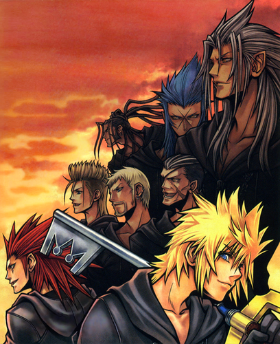 by MateusinhoEX |
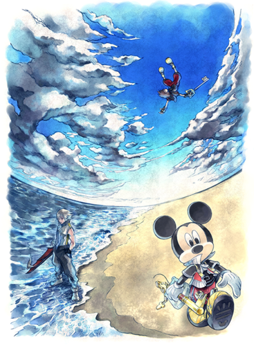 by MateusinhoEX |
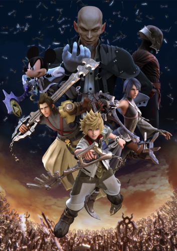 by MateusinhoEX | |
To request an image, please contact FinalRest | |
 | |
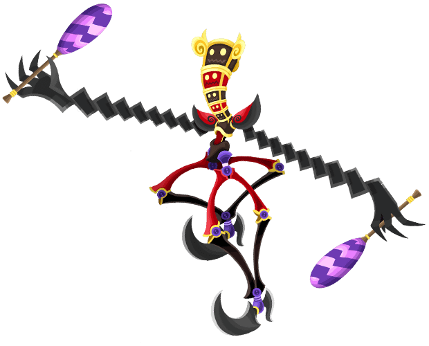
 A mysterious curse has been wrought upon the world of Kingdom Hearts! All the wicked foes that stand in the way of our favorite protagonists have been gifted with the power of invisibility! Thankfully, our quick wiki editors who are skilled in the ways of magic - as all good editors are - have managed to capture some monsters, but they need your help identifying what type of beast they have found, so their un-invisiblity spells work correctly. Help us out! Do you know who this beast is?  Hover here for the answer! This issue's beast was captured by KeybladeSpyMaster. |
 Blond blonde THROW! Do you suit the black? Who am I? Hover here for the answer! Submitted by FinalRest Lit up in blue Why so paranoid? He is not the only form... Hover here for the answer! Submitted by FinalRest Something, something, RIDDLE! Hover here for the answer! Submitted by FinalRest <Insert confusing question> Hover here for the answer! Submitted by FinalRest Bam! Riddle to the face! Hover here for the answer! Submitted by FinalRest |
 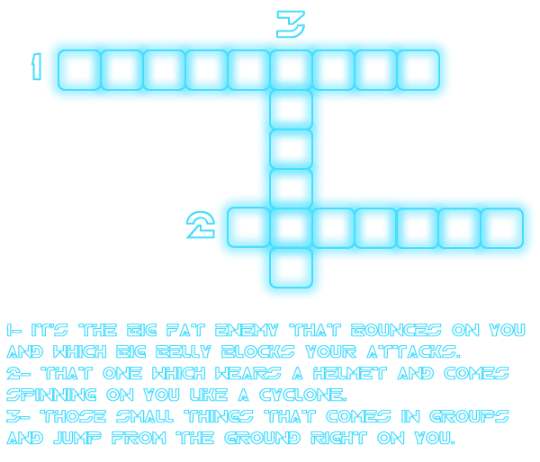 Click here to see the answer! [{{{gridcrosswordprint}}} Printing version] Submitted by MateusinhoEX | |
 | |||||

Great question, the reason that I'm so awesome is a secret that has been passed down the fire family for generations. So unfortunately I can't answer your question. But if you want to be a little awesome, get to know RoxasXIIILK and do the exact opposite of what he does.
I just answered this question...
LEAVE ME ALONE!
| |||||
 by Chainoffire | |||||
 |
 |
 | |||
 Have you completed one or more of the tasks above? Do you feel like you deserve a shiny medal? Well, send a notice of your achievement to kingdomheartswikibcrat@gmail.com and you'll get one to put on your userpage! Plus your name will be featured in our next issue in the box below! What are you waiting for? Get to work! Be sure to make "Magazine" your subject title or else your email may be overlooked. It is required that you have an account on either the KHWiki or the Keyhole to have your name featured. Your account name must be included in the email. Contributions will be checked to ensure that wiki related tasks have been completed correctly. |
 <polldaddy pollid="8134013"/> Question submitted by Chainoffire </nowiki> | ||||
 The following users completed the tasks in our last issue. Everyone give a round of applause to: This guy, who did the thing! That guy, who did the other thing! All the other guys who did the less impressive but still deserving of reward things! | |||||
Seems like it's coming along nicely. One thing though - is there any chance of changing the color scheme of the Contents page? Personally, it looks a bit dull and awkward. I think different fonts will look very good and perhaps a dark grey or silver will work better. Just a suggestion. TheFifteenthMember 19:41, 28 March 2013 (UTC)
- This is a cool way to see how it all comes together. ^^ I'm all for changing the Contents colors, but I don't have any ideas, so go ahead and do what you think'll look nice. :) Oh, and I also filled in some of the other spaces, to see how they look.

 FINALREST
 09:50, 2 April 2013 (UTC)
Would you mind if I moved the author bit to under the title? I think it would look nicer that way... Also, do we have anyone to work on the page title images? Cause if we don't I could have a crack at them. :)  This concludes my wonderful story!
  03:38, 7 April 2013 (UTC)
- Erry said he would like to make images, but I don't think he would be upset if you give it a try. About the titles, I will change them for you, don't worry. If you want, you can make any changes to the magazine, okay? MateusinhoEX 16:48, 8 April 2013 (UTC)
Reboot!
Heya MEX, it's been a while! Since this is getting a fresh start, I'd once again like to offer my help. Is there anything you need help with regarding the template? 
 FINALREST
 14:54, 17 April 2014 (UTC)
- Hey, FR, just in time!! Im really needing help with this, since I don't have much freetime now. Basically, I need you to help me style the remaining pages, like, color of them and things like. If you want to put some fancier styles, such as shadows in the boxes and things like that we can think about it. Also, if you can help me check the variables of each article (I mean, the blank spaces, such as {{{autorname}}} and {{{topfive}}}, for example</nowiki. And I think it's just that for now. I will make some edits now and get things going. Thanks for the help! - ~~~~
Hey MEX, I also signed up to help with the coding. Is there anything you need me to do? ![]() KeybladeSpyMaster
KeybladeSpyMaster ![]() 04:27, 18 April 2014 (UTC)
04:27, 18 April 2014 (UTC)
- Lucky there's plenty help :) Basically, I need you to do the same things as FR. I managed to make a good draft now, so yeah, there's just more adjusts to do. Thanks!! - MateusinhoEX 13:48, 18 April 2014 (UTC)

|
| |||||||||||||||||||||||||||||||||||||||||||||||||||||||||||||||||||||||||||||||||||||||||||||||||||||||||||||||||||||||||||||||||||||||||||||||||||||||||||||||||||||||||||||||||||||||||||||||||||||||||||||||||||||||||||||||||||||||||||||||||||||||||||||||||||||||||||||||||||||||||||||||||||||||||||||||||||||||||||||||||||||||
Is it okay if I add my flick rush page to the template above? ![]() Chainoffire
Chainoffire![]() 02:21, 3 May 2014 (UTC)
02:21, 3 May 2014 (UTC)
The Door to Light

|
| |||||||||||||||||||||||||||||||||||||||||||||||||||||||||||||||||||||||||||||||||||||||||||||||||||||||||||||||||||||||||||||||||||||||||||||||||||||||||||||||||||||||||||||||||||||||||||||||||||||||||||||||||||||||||||||||||||||||||||||||||||||||||||||||||||||||||||||||||||||||||||||||||||||||||||||||||||||||||||||||||||||||

|
| |||||||||||||||||||||||||||||||||||||||||||||||||||||||||||||||||||||||||||||||||||||||||||||||||||||||||||||||||||||||||||||||||||||||||||||||||||||||||||||||||||||||||||||||||||||||||||||||||||||||||||||||||||||||||||||||||||||||||||||||||||||||||||||||||||||||||||||||||||||||||||||||||||||||
Flick Rush
Okay, so since we're not gonna have a mailbag until after the first issue, what do we want to have for the first mailbag? Also, I have some issues with the template, and maybe someone here can help me with them:
- I want to put images on the sides of the titles (Keyhole Tasks, KHWiki Tasks, Mailbag, and Game Task) but I can't because of the coding used here.
- How do I put words after To prove success in the task... ? are we just going to finish the sentence on the master template?
 Chainoffire
 02:15, 5 May 2014 (UTC)
- I can't answer all of it, but as far as the "To prove success in the task..." part, I had intended to have it finished on the master template. There's a comment on the template coding right there that requests the information, which I put, because I don't know where the items (questions, proof, etc.) are supposed to be sent. As for the images, I don't know if you want images on each side, since the titles are supposed to eventually be images themselves. If you still want them, I'll see if I can get it coded in, maybe as optional parameters or something. I'll see how to get it to work. As I mentioned to FM above, it'll have to wait until the end of the week at this point, because of my AP test.
 KeybladeSpyMaster
  23:18, 5 May 2014 (UTC)
- I didn't know that the titles would turn into images, so we can just leave them then. I think that it would depend on the challenge. For example, assuming that the challenge is the one in the test template (Complete Holo-Mission 93: Believe Wearing the Extreme Ring and without the Auto-Life Panel). I would probably want screenshots of the ending screen, a screenshot of their panels, and a screenshot right as you start. Also, where would the screenshots go? Would they be sent to the KHWiki email, or could they be sent to my email, since I wrote the article? (either one is fine with me). Thirdly, should we have a section where we put the names of the users who completed the project? Finally, what would happen to those users that did complete the project? Would they just get special mention in the article or would we select one to get a prize? Good luck on your AP Calc test by the way!
 Chainoffire
 04:48, 6 May 2014 (UTC)
- I think the screenshots should be sent to the KHWiki email and then the information would be conveyed to the writer. That way, potential writers won't be put off by having their email displayed publicly. And, as I said earlier, we could give those who finish tasks a special mention on the next issue, an accolade (which I'll work on), and first priority in making image requests and mailbag questions. TheFifteenthMember 18:24, 6 May 2014 (UTC)
- I didn't know that the titles would turn into images, so we can just leave them then. I think that it would depend on the challenge. For example, assuming that the challenge is the one in the test template (Complete Holo-Mission 93: Believe Wearing the Extreme Ring and without the Auto-Life Panel). I would probably want screenshots of the ending screen, a screenshot of their panels, and a screenshot right as you start. Also, where would the screenshots go? Would they be sent to the KHWiki email, or could they be sent to my email, since I wrote the article? (either one is fine with me). Thirdly, should we have a section where we put the names of the users who completed the project? Finally, what would happen to those users that did complete the project? Would they just get special mention in the article or would we select one to get a prize? Good luck on your AP Calc test by the way!
- I'm back! And, apparently, still alive... Anyways, could I have the KHWiki email to put in the template (or could someone else put it in)? As far as the image titles go, I have a potential idea of using the Menu font for it (see Pause Menu, Flick Rush logo, Commands Menu, the sidebar headers on this wiki, you get the idea, no?). Does anyone know where to get it? If not, I'll try to use Photoshop to cut the letters out, but I'd rather not.
 KeybladeSpyMaster
  23:41, 7 May 2014 (UTC)
- I'm back! And, apparently, still alive... Anyways, could I have the KHWiki email to put in the template (or could someone else put it in)? As far as the image titles go, I have a potential idea of using the Menu font for it (see Pause Menu, Flick Rush logo, Commands Menu, the sidebar headers on this wiki, you get the idea, no?). Does anyone know where to get it? If not, I'll try to use Photoshop to cut the letters out, but I'd rather not.
I was going to add the "GuesstheBeast" image until I encountered this. The size can be changed easily enough, but the problem is the invisibility the black has against the background. Is it possible to add a glow around the silhouette as a border? TheFifteenthMember 18:09, 8 May 2014 (UTC)
- Thanks for the image for the titles. I hope it will help. What I ended up doing is I'm making a font file online for free with the help of Photoshop, so that's how that's going to go. As far as the Guess the Beast image goes, is the new one okay? I added a glow somewhat as I did for the TRON disk from my talk bubbles, though granted, it seems a little more intense on the Large Body than on the Keyblade logo.
 KeybladeSpyMaster
  03:15, 9 May 2014 (UTC)
Erry made a banner for the Mirage Arena and Underdrome, which we can use to promote them and get people involved in them. The idea is we'll have the banner at the bottom of the "Coliseum" page, have text above that says "For more, visit..." and set up links. That means we can get rid of the Mirage Arena and Underdrome sections so we can focus on the Station of Awakening part. Speaking of which, the SoA will need to be divided into two with each side having a title, image and space for text so it'll be like the current Mirage Arena format. TheFifteenthMember 17:09, 9 May 2014 (UTC)
- I like the banner. Maybe we could add the words "Mirage Arena" and "The Underdrome" to the banner? (In the appropriate texts)
 Chainoffire
 20:57, 9 May 2014 (UTC)
Minor Points

|
| |||||||||||||||||||||||||||||||||||||||||||||||||||||||||||||||||||||||||||||||||||||||||||||||||||||||||||||||||||||||||||||||||||||||||||||||||||||||||||||||||||||||||||||||||||||||||||||||||||||||||||||||||||||||||||||||||||||||||||||||||||||||||||||||||||||||||||||||||||||||||||||||||||||||||||||||||||||||||||||||||||||||
 Thanks for getting started on this MEX! Just adding onto Caf's list and what sections need to be on each page:

 Hello again. :) So, I spaced out the contents and I think it's a lot less cramped now, but it also leaves a big gap to the right of the box. I was thinking of ways to fill it, and I was thinking maybe we could put a sort of collage thing there to fill in the gap.




 - Greetings, users. System is up, and ready for user input. - 10:06 AM Sun, May 4, 2014 MST