User talk:MateusinhoEX/MagazineTest: Difference between revisions
MateusinhoEX (talk | contribs) (→Test) |
No edit summary |
||
| Line 68: | Line 68: | ||
|archivesautor=By MateusinhoEX | |archivesautor=By MateusinhoEX | ||
|news1title=Kingdom Hearts HD 1.5 ReMIX Released in Japan!! | |news1title=Kingdom Hearts HD 1.5 ReMIX Released in Japan!! | ||
|news1=[[File:Kingdom Hearts HD 1.5 ReMIX Logo.png|right|250px]] | |news1=[[File:Kingdom Hearts HD 1.5 ReMIX Logo KHHD.png|right|250px]] | ||
Two weeks ago, in March 14<sup>th</sup>, a HD compilation of the first three games of the series was released. Yeah, guys, the long wait for ''Kingdom Hearts HD 1.5 ReMIX'' has ended, at least for who leave in Japan. We still will have to wait a little more to have this game in our hands, because the NA release is estimated to only Fall 2013. Although, our friend here Erry has imported a Japanese copy of the game and is doing a Livestream. You can check the link to it in our main page. Please take a look!! | Two weeks ago, in March 14<sup>th</sup>, a HD compilation of the first three games of the series was released. Yeah, guys, the long wait for ''Kingdom Hearts HD 1.5 ReMIX'' has ended, at least for who leave in Japan. We still will have to wait a little more to have this game in our hands, because the NA release is estimated to only Fall 2013. Although, our friend here Erry has imported a Japanese copy of the game and is doing a Livestream. You can check the link to it in our main page. Please take a look!! | ||
{{-}} | {{-}} | ||
Revision as of 15:00, 14 October 2013
Section Names
- 1 Keyhole Report-keyhole stuffs
- 2 .net Report-.net stuffs
- 3 Trinity Archives-KH news
- 4 Featured Media- what it says
- 5 Dive to the Heart-walkthrough of the day
- 6 Olympus Coliseum-arena page
We need a better name for page 1,2, and 4. Suggestions? SubZeroFlames
- Page 1: The Keyhole's Unlocking
Page 2: Kingdom Hearts's Renewal
Page 4: Hall of Rewards. I dunno something like that? Erry 20:21, 4 March 2013 (UTC)

|
| |||||||||||||||||||||||||||||||||||||||||||||||||||||||||||||||||||||||||||||||||||||||||||||||||||||||||||||||||||||||||||||||||||||||||||||||||||||||||||||||||||||||||||||||||||||||||||||||||||||||||||||||||||||||||||||||||||||||||||||||||||||||||||||||||||||||||||||||||||||||||||||||||||||||
- Of course you can help, Final Rest. I would be grateful. Today I have some homework to do, so I will not be able to help very much. But if you want, you can change the template, anything. - MateusinhoEX 14:21, 6 March 2013 (UTC)
Contents
I was taking a look at the contents page and I think it might be too cramped to put both the Secret Report and the Contents on the same page. The contents should be the main focus, so it should go up the top, but in that case I don't want the Secret Report to just be shoved to the bottom of the page. So, I was wondering if you think we should tab the contents page so it'd look something like this. Do you think that makes the page tidier or do you think it should be left as it looks now? 
 FINALREST
 09:57, 12 March 2013 (UTC)

|
| |||||||||||||||||||||||||||||||||||||||||||||||||||||||||||||||||||||||||||||||||||||||||||||||||||||||||||||||||||||||||||||||||||||||||||||||||||||||||||||||||||||||||||||||||||||||||||||||||||||||||||||||||||||||||||||||||||||||||||||||||||||||||||||||||||||||||||||||||||||||||||||||||||||||
- Looks good, but how would we pick which images to put? TheFifteenthMember 14:30, 16 March 2013 (UTC)
- Hey guys!! I am a little busy these days. Well, lets explain somethings:
- About the Secret Report. Do you wish to leave it as it is, or change it's look, with it's new colors to make it look like the other pages, or change all other pages to look like it? Or just leave it different, like a special page?
- About the missing pages. I just didn't had time to add them yet, no special reasons XD.
- And last, about gaps, not just in contents, but in any pages it may happen. I can't help with this, because I use a resolution in which... well... there aren't any gaps!! So, you solve it as you wish. I can only say that the images looks veeeery good. I loved them. We could use images related to the respective Trinity Archives and Dive to the Heart of the issue. For example, images of KHHD ReMIX, χ[chi], and some of the game in the walkthrough of that issue.
MateusinhoEX - 16:02, 16 March 2013 (UTC)
For the secret report, I just tried to make it look as similar to the real Secret Report in the game as I could. I would've been able to do more with html, but, well, wikia *shakes fist angrily*. I think it's fine to have the pages a little different, especially since pages like the Featured Editor page will be changed according to the author for that issue, so the variety will be a good change. As for the contents, since you guys like it, I'll add in a code later for the image. For the pictures, you hit the nail on the head, MEX. I too was thinking we just customize them according to the content of that issue, so I guess we'll just do that. :) 
 FINALREST
 13:41, 17 March 2013 (UTC)
- Fine. Then these points are solved. I will just add the missing pages. I also don't know how to do with the Roundtable page. Could you help me? MateusinhoEX - 16:17, 17 March 2013 (UTC)
Test
Well, I decided to test some sections of the Magazine to see if they are working properly.
 | ||
Page 3 - The Ansem Reports
Page 4 - Unlocking the Keyhole
Page 5 - The Door to Light
Page 6 - The Coliseum
Page 7 - The Keyblade Master
Page 8 - Dive to the Heart
Page 9 - The Round Room
Page 10 - Mark of Mastery Exam
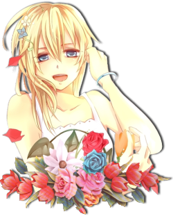
Page 11 - Naminé's Sketchbook
Page 12 - The Grid
Page 13 - Flick Rush
| ||
 by [[User:{{{ansemreportsauthor}}}|{{{ansemreportsauthor}}}]] |
 by [[User:{{{unlockingthekeyholeauthor}}}|{{{unlockingthekeyholeauthor}}}]] | ||
 | ||
| {{{unlockingthekeyholejiminysjournal}}} | ||
 | ||
 | ||
| {{{unlockingthekeyholenewusers}}} | ||
 | ||
| {{{unlockingthekeyholeteaparties}}} | ||
 by [[User:{{{doortolightauthor}}}|{{{doortolightauthor}}}]] | ||
 | ||
| {{{doortolighttrinityarchives}}} | ||
 | ||
| {{{doortolightnewusers}}} | ||
 | ||
| {{{doortolightroundtable}}} |
 | |||||||||||

| |||||||||||
 | |||||||||||
[[User:{{{coliseumfightauthor1}}}|{{{coliseumfightauthor1}}}]] |

|
[[User:{{{coliseumfightauthor2}}}|{{{coliseumfightauthor2}}}]] | |||||||||
| {{{coliseumfight}}} | |||||||||||
 | |
by [[User:{{{keyblademasterauthor1}}}|{{{keyblademasterauthor1}}}]] {{{keyblademasterpage1}}} | |
 | |
by [[User:{{{divetotheheartwikitutorialauthor}}}|{{{divetotheheartwikitutorialauthor}}}]] | |
by [[User:{{{divetotheheartgametutorialauthor}}}|{{{divetotheheartgametutorialauthor}}}]] |
 | |||
 | |||
|
| ||
 | |
{{{markofmasteryexamreview}}} | |
{{{markofmasteryexamtopfive}}} | |
Interview conducted by [[User:{{{markofmasteryexaminterviewauthor}}}|{{{markofmasteryexaminterviewauthor}}}]] {{{markofmasteryexaminterview}}} |
 Art compiled by [[User:{{{naminessketchbookauthor}}}|{{{naminessketchbookauthor}}}]] | |
To request an image, please contact [[User:{{{naminessketchbookauthor}}}|{{{naminessketchbookauthor}}}]] |
 | |
 A mysterious curse has been wrought upon the world of Kingdom Hearts! All the wicked foes that stand in the way of our favorite protagonists have been gifted with the power of invisibility! Thankfully, our quick wiki editors who are skilled in the ways of magic - as all good editors are - have managed to capture some monsters, but they need your help identifying what type of beast they have found, so their un-invisiblity spells work correctly. Help us out! Do you know who this beast is? {{{banishthebeastimage}}} Hover here for the answer! This issue's beast was captured by [[User:{{{gridbanishthebeastartist}}}|{{{gridbanishthebeastartist}}}]]. |
 {{{gridriddle1}}} Hover here for the answer! Submitted by [[User:{{{gridriddle1author}}}|{{{gridriddle1author}}}]] {{{gridriddle2}}} Hover here for the answer! Submitted by [[User:{{{gridriddle2author}}}|{{{gridriddle2author}}}]] {{{gridriddle3}}} Hover here for the answer! Submitted by [[User:{{{gridriddle3author}}}|{{{gridriddle3author}}}]] {{{gridriddle4}}} Hover here for the answer! Submitted by [[User:{{{gridriddle4author}}}|{{{gridriddle4author}}}]] {{{gridriddle5}}} Hover here for the answer! Submitted by [[User:{{{gridriddle5author}}}|{{{gridriddle5author}}}]] |
 {{{gridcrossword}}} [{{{gridcrosswordanswer}}} Click here to see the answer!] [{{{gridcrosswordprint}}} Printing version] Submitted by [[User:{{{gridcrosswordauthor}}}|{{{gridcrosswordauthor}}}]] | |
Seems like it's coming along nicely. One thing though - is there any chance of changing the color scheme of the Contents page? Personally, it looks a bit dull and awkward. I think different fonts will look very good and perhaps a dark grey or silver will work better. Just a suggestion. TheFifteenthMember 19:41, 28 March 2013 (UTC)
- This is a cool way to see how it all comes together. ^^ I'm all for changing the Contents colors, but I don't have any ideas, so go ahead and do what you think'll look nice. :) Oh, and I also filled in some of the other spaces, to see how they look.

 FINALREST
 09:50, 2 April 2013 (UTC)
Would you mind if I moved the author bit to under the title? I think it would look nicer that way... Also, do we have anyone to work on the page title images? Cause if we don't I could have a crack at them. :)  This concludes my wonderful story!
  03:38, 7 April 2013 (UTC)
- Erry said he would like to make images, but I don't think he would be upset if you give it a try. About the titles, I will change them for you, don't worry. If you want, you can make any changes to the magazine, okay? MateusinhoEX 16:48, 8 April 2013 (UTC)
 Thanks for getting started on this MEX! Just adding onto Caf's list and what sections need to be on each page:

 Hello again. :) So, I spaced out the contents and I think it's a lot less cramped now, but it also leaves a big gap to the right of the box. I was thinking of ways to fill it, and I was thinking maybe we could put a sort of collage thing there to fill in the gap.


